


above: The traditional home keeps its classic charm, with a bold pink front door that adds just the right pop of personality.
Pretty in Pink
Taking on tradition with rose-colored glasses
INTERVIEW WITH MICHELLE MORGAN HARRISON, MORGAN HARRISON HOME
PHOTOGRAPHY BY JANE BEILES

Who lives here?
They are a young family with two smaller kids. The husband played professional hockey, and the kids needed space to play, too. They had been in a smaller lot in town and had been dreaming about a bigger lot with lots of playing fields.
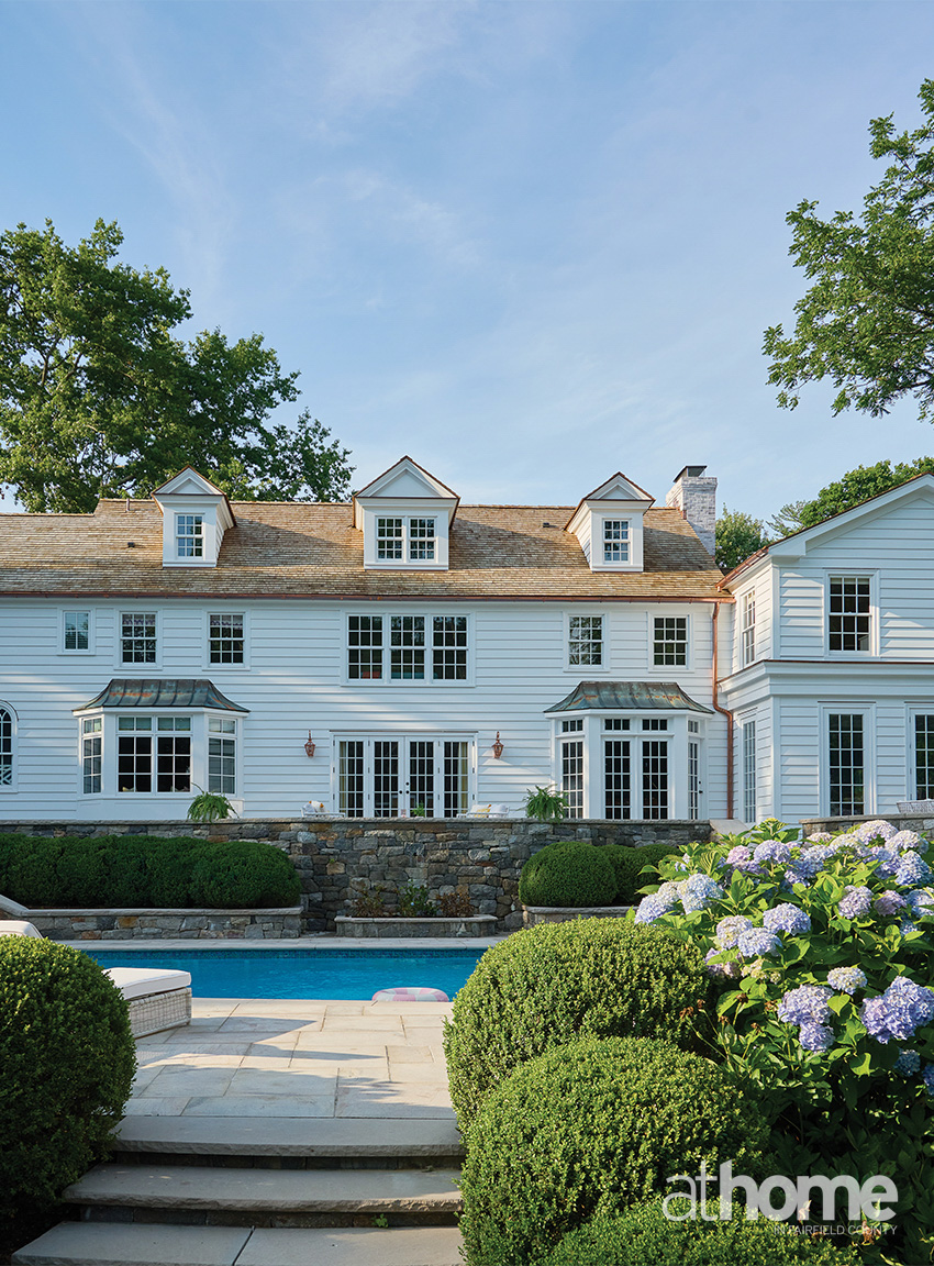
They found this fabulous lot, but the house had this kind of Tuscan look. We worked with Schettino Architects on the house and added a brick façade. The layout of the house basically remained the same.
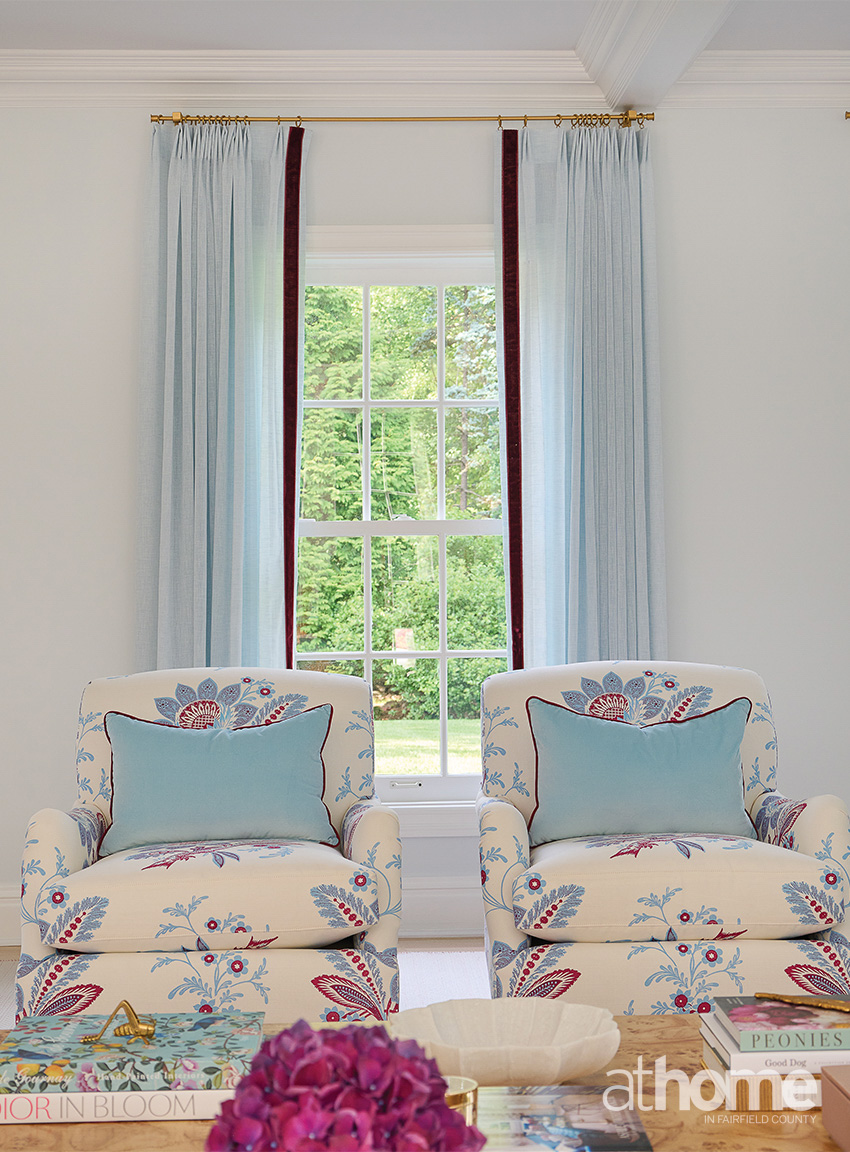
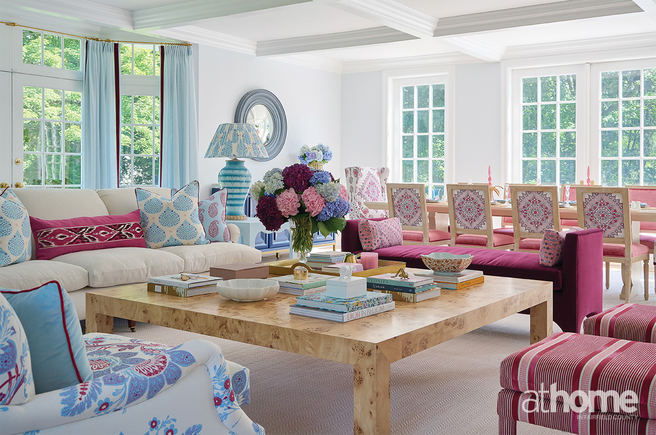
It was really about the transformation, and the wife loves pink. The husband leaned more into the light blues, so the living room became a blend of the two of them.
And we really played with color. We started by bringing her trays of prints and asking her to pick what she liked. Once we saw what she gravitated to—which was definitely “more is more”—it was really quite fun to design.
When did you decide on the pink front door?
It was discussed early on, and her husband initially said, “No,” that it was a bridge too far. But then, when we got into the brick and we lime washed it and saw the white shutters, we realized it was perfect. And that pink is the same pink that we’d already painted the cabinets in the mudroom.
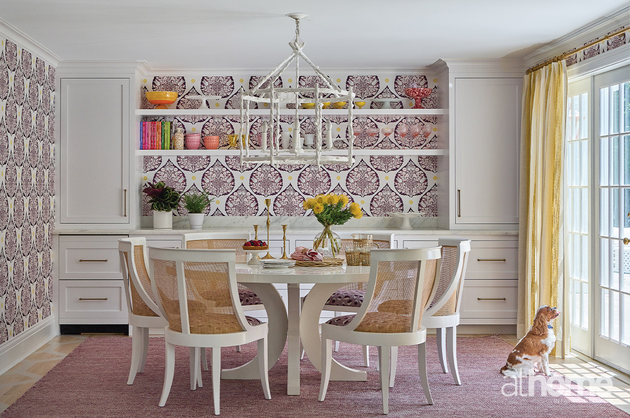
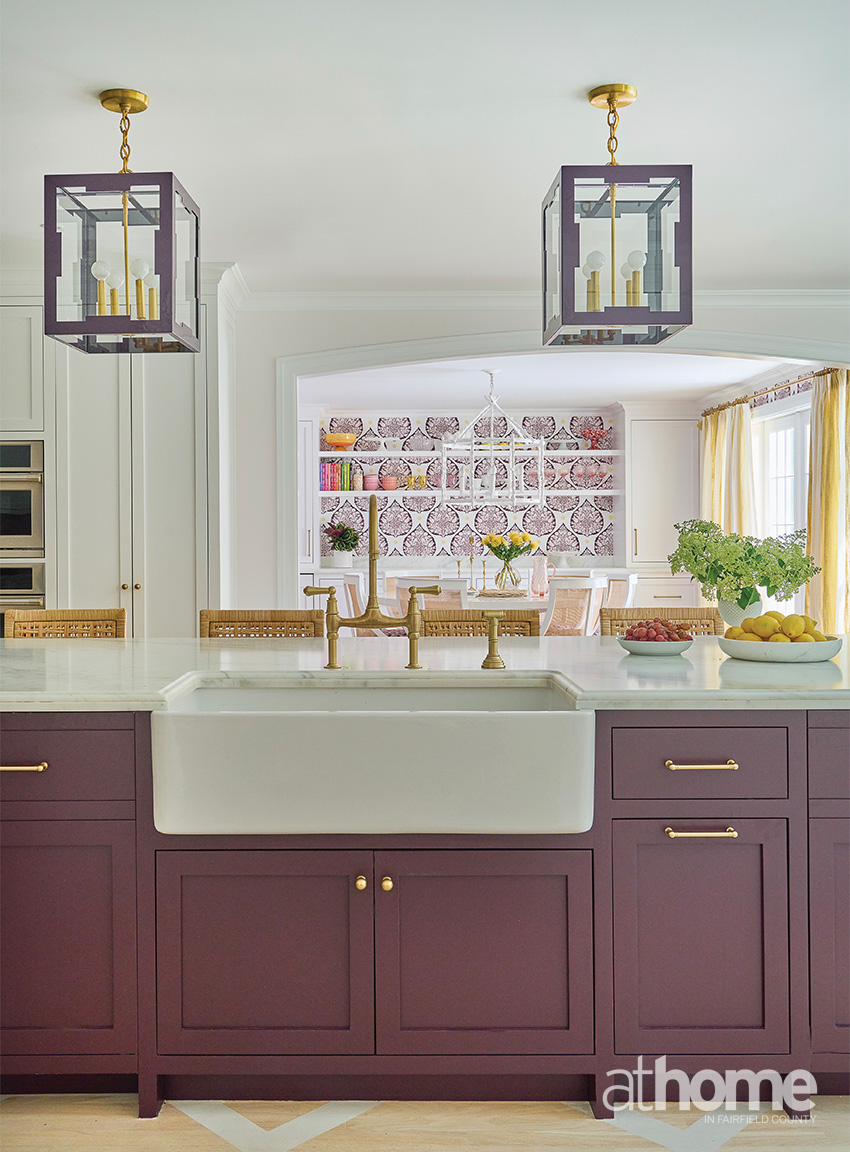
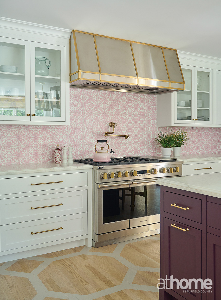
Tell us about this kitchen.
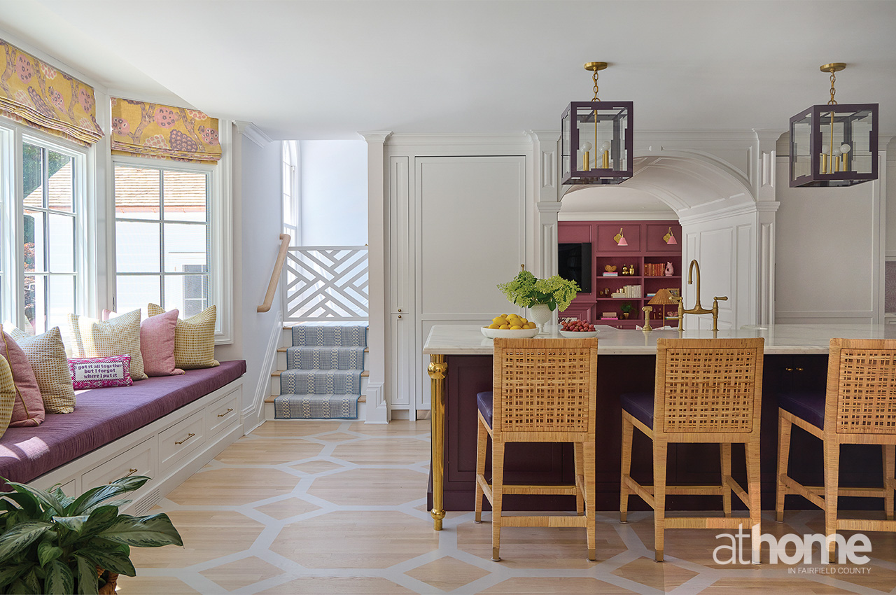
It’s obviously a lot of fun with all the color, but the original layout had the breakfast table in the bay window, and she really wanted a big seating area. They entertain a ton and are always having people over. It was important for her to have a lounge area in the kitchen where people could sit and have a cocktail while talking and hanging out. We also created that whole breakfast bar, which became an extra serving space.
I think the biggest thing was finding something special for the backsplash. That was a big challenge. We did a marble backsplash with a custom color, which was pretty special. Then we added a custom hood, bringing the brass in. The walls are the most subtle shade of pink.
Do you find pinks to be hard to work with?
Exceedingly so. It can look like cotton candy or Pepto-Bismol in a heartbeat. I can’t tell you how many times I’ve cut a pink color to 25%. And that’s why finding this one, I was like, “Oh, that’s a good one!”
Did you know from the start that this was going to have a lot of bold color?
Yes, because of her existing house. She wanted it everywhere. She had a lot of blue and pink and a lot of a bold pattern and print in her existing house, but it was a different vibe. So, we knew that’s where we were going. And we did more unexpected things with the colors, which I think was really interesting.
Do you have a favorite room or moment from this project?
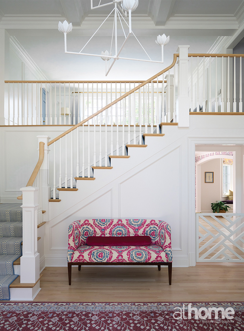
There’s something kind of fun about walking in through the pink door into that foyer space that tells a story for the whole house.
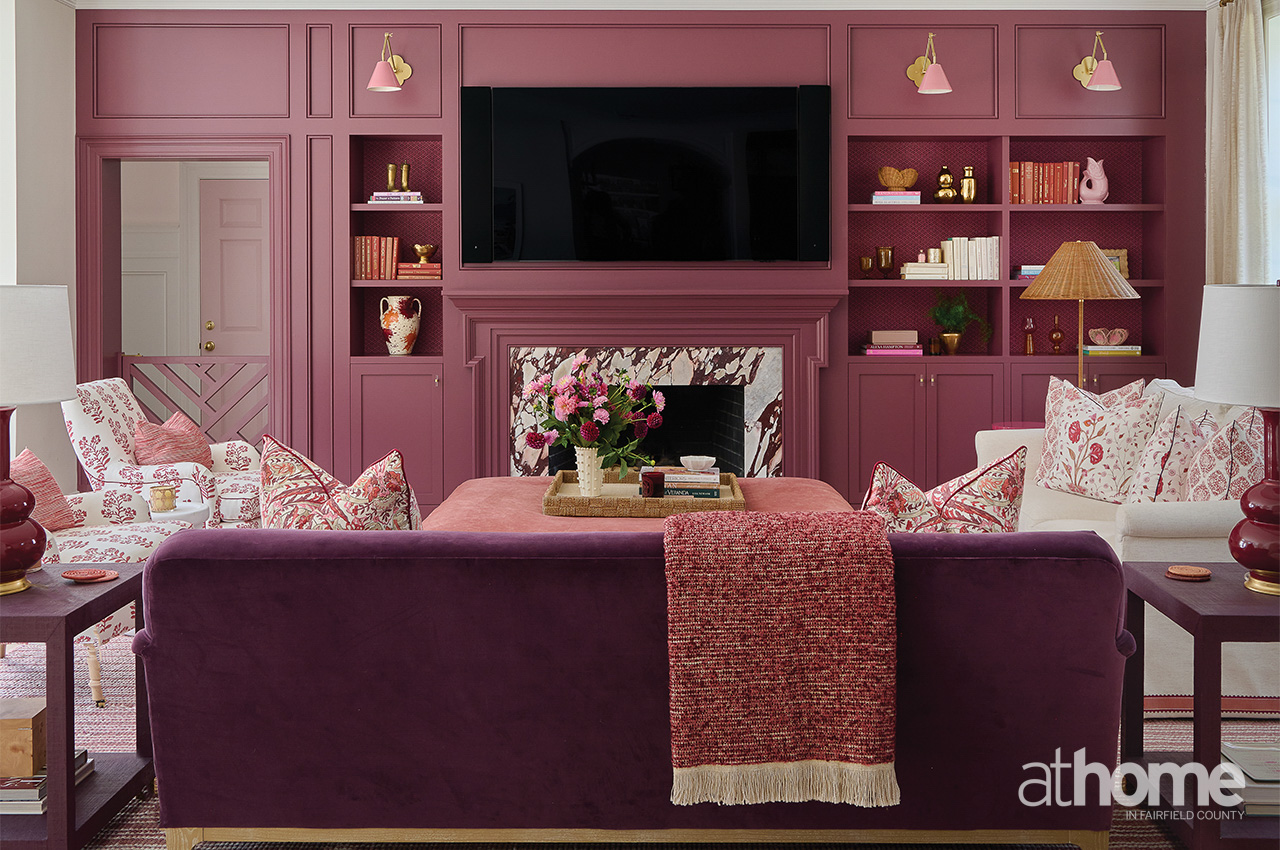
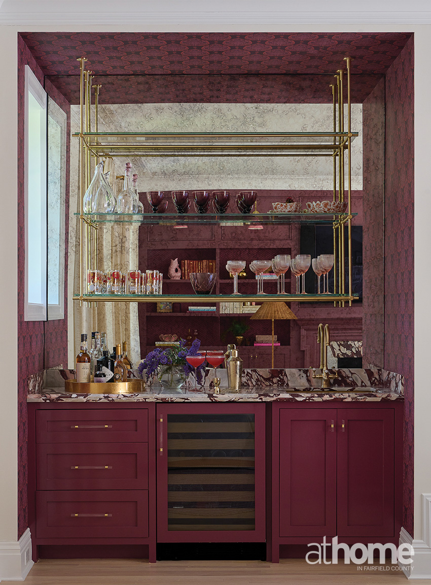
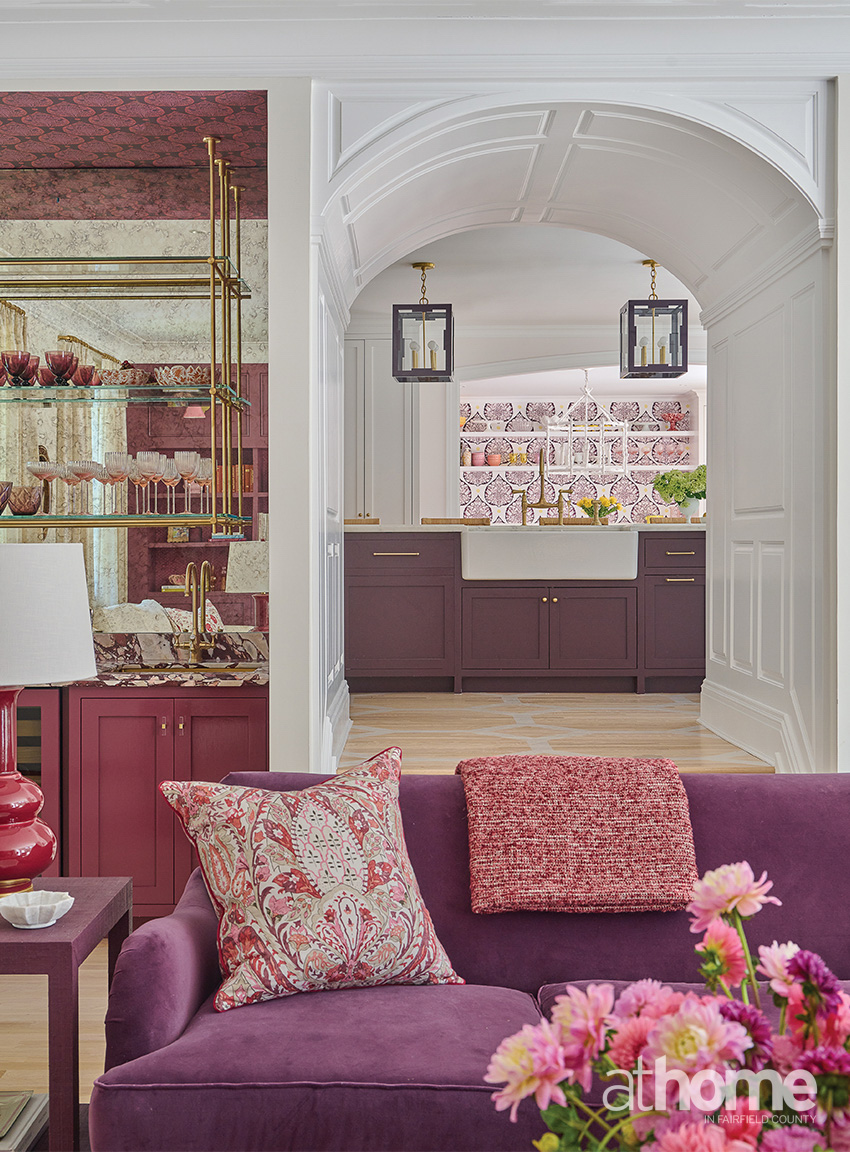
I really think that the family room is pretty divine, because it’s moody and it’s just layered and comfy. I have to say that’s probably my favorite. The color is called Adventurer by Little Greene, and it’s a cross between maroon and eggplant, a grapey tone. I love the Hwang Bishop sconces over the bookshelves, which are backed with custom-colored Galbraith & Paul paper. And then there’s the wet bar with the Calacatta Viola marble.
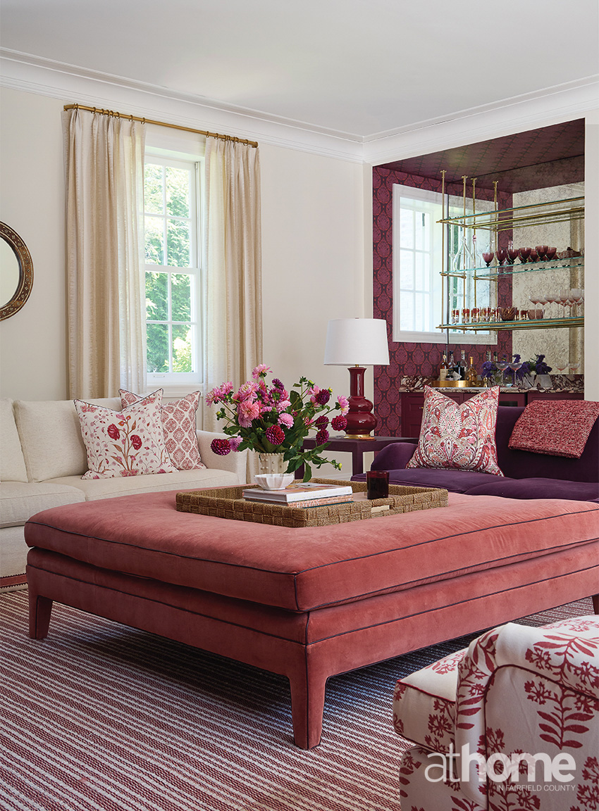
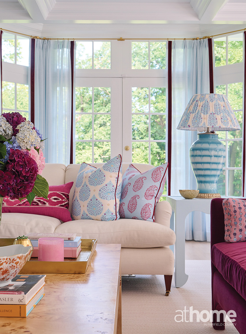
The living room also came together really well, and it was the closest to her original vision. It’s where we were able to bring in the blues, and I love that kind of claret with the brighter blue.
We loved doing the accessories for this house. It was so much fun. I went to Found in New Canaan, and the owner let me into the basement, and I just went crazy down there, finding ice cream bowls and things like that. We bought vintage glassware and then sourced pieces from all over; all the pink things.
And I have to say, I love embracing yellow again.
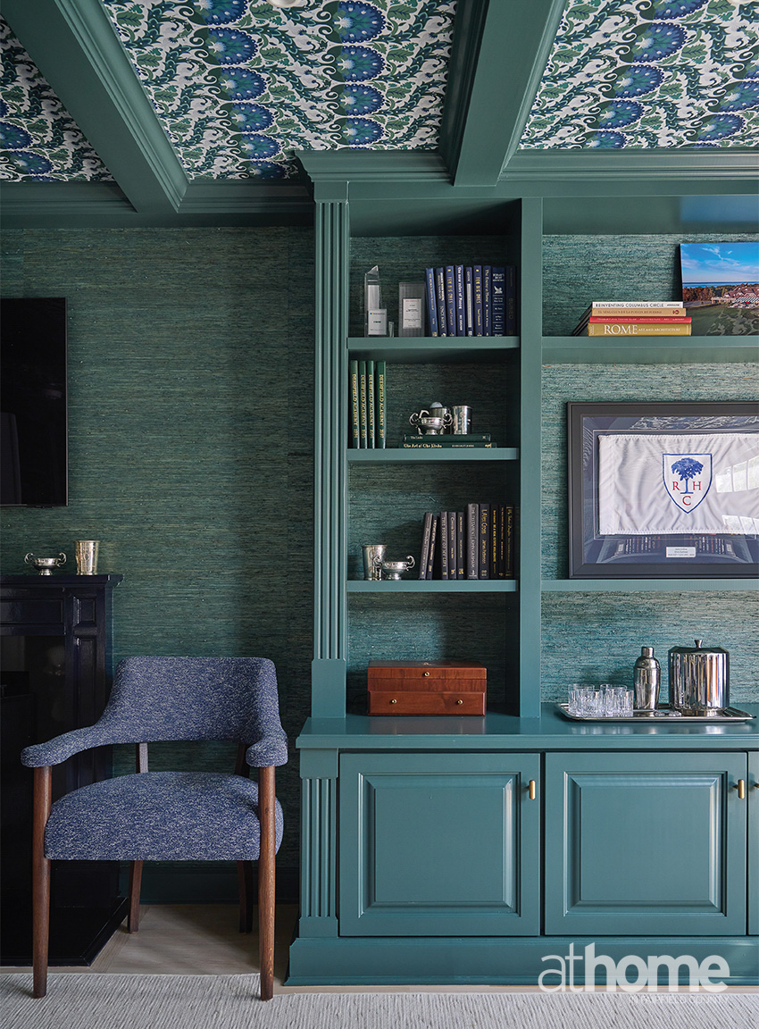
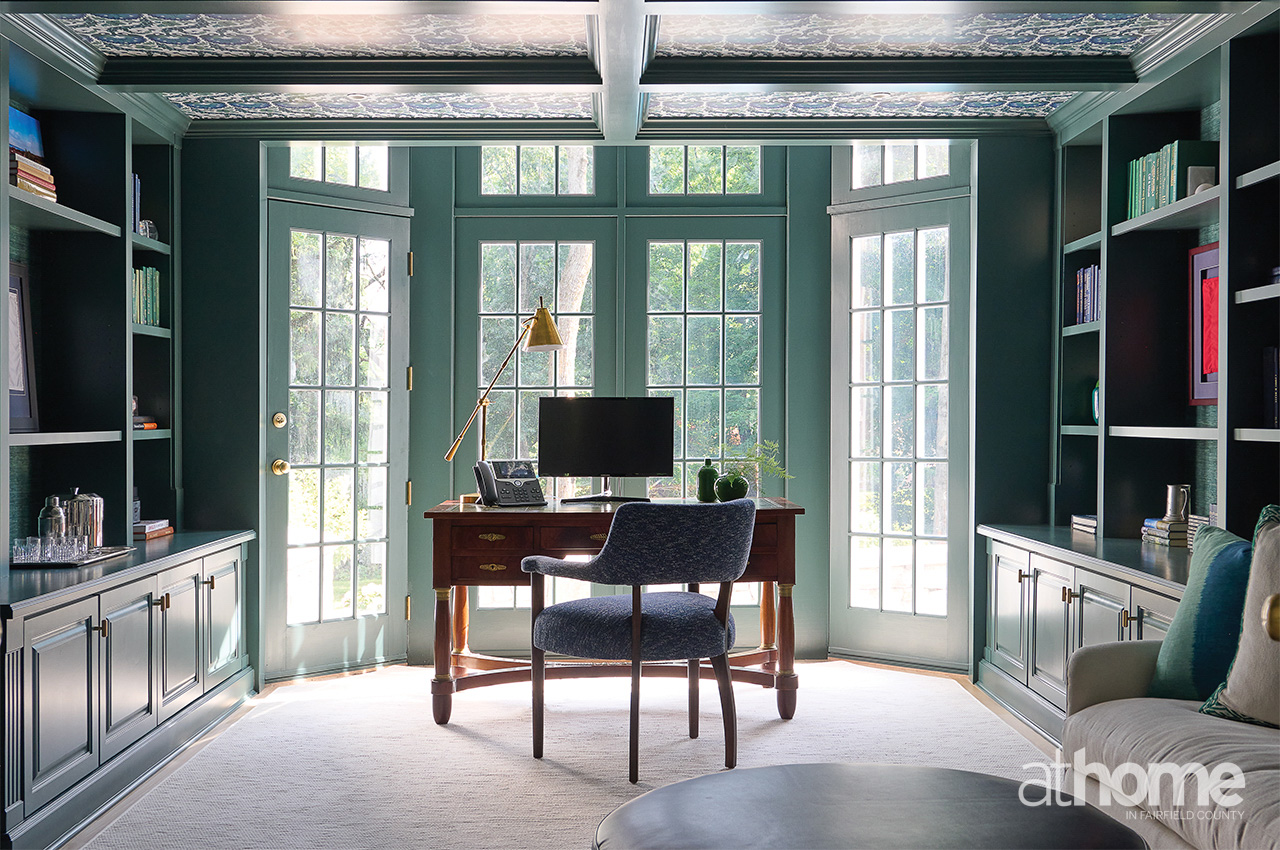
Tell us about this office.
He loves green. So, we landed on a combination of greens and navy. That was an existing office, and we added the coffer detail and then the wallpaper and paint. We did a green grasscloth from Phillip Jeffries on the wall, and then we did the ZAK + FOX on the ceiling, which is where we pulled the palette for the room.
We painted the mantel in Dock Blue from Little Greene, and all of the cabinetry color is Hidden Falls from Benjamin Moore.
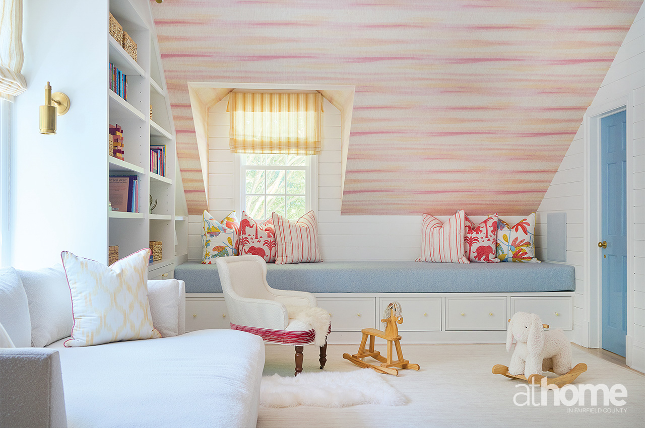
This kids’ space is super fun. Tell us about it.
The addition of the mudroom meant that we were able to expand the playroom on the second floor. We knew that she really wanted yellow, and then we added some blue and pink in there, too. I immediately thought of this Thibaut line for the wallpaper and some pillows. We did a custom penny tile on the bathroom floor, which was super cute.
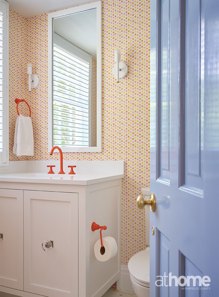
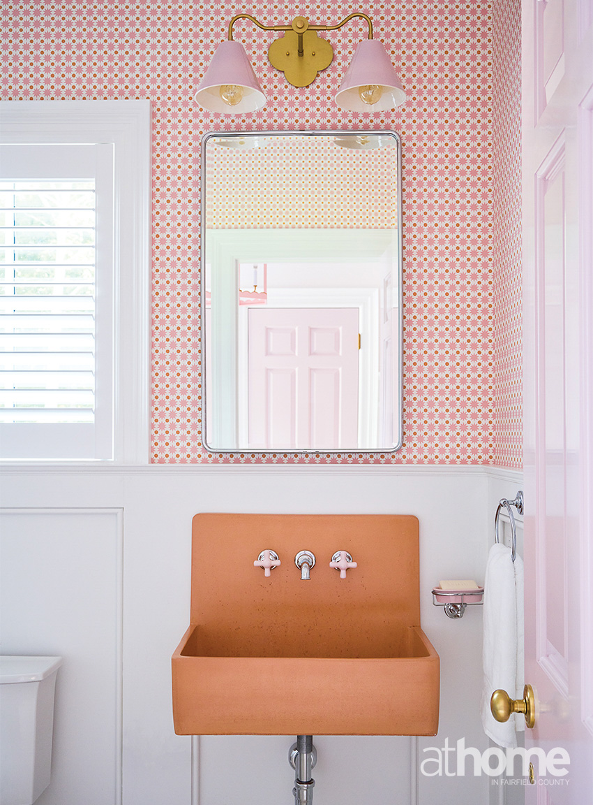
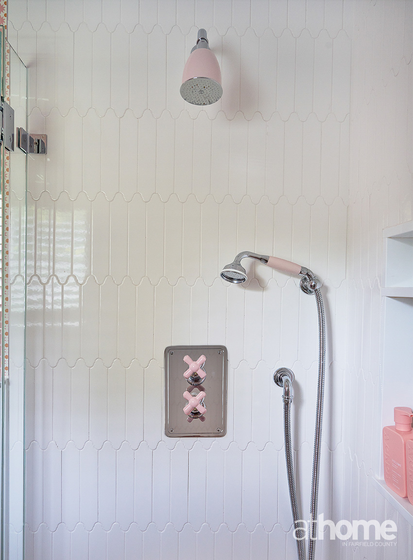
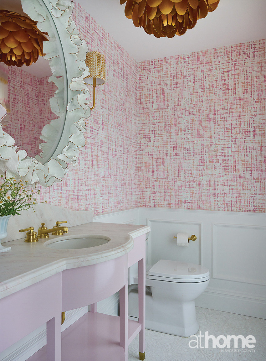
There are lots of fun bathroom moments in this house.
Yes, the formal powder room has a pink sink. The one off the mudroom has an orange sink with porcelain pink handles and a pink shower.
What was the biggest challenge?
Honestly, the biggest challenge was for me to wrap my head around ‘More is more,’ you know? You have to let loose and have fun with it. My brain works a certain way, and it was just fun to kind of break out of the mold and just think, “Why not?” So, the biggest challenge was also the most fun part of it.
Why is color so important to you?
Color is important, whether it’s subtle or bold; the way it’s layered, the way it can make you feel cozy, make you feel calm, the way it can energize. So many emotions are tied to color, and I think this house makes you happy. I think that’s the important thing. Not everyone gets to play every day. That’s what’s so fun about this.
RESOURCES:
Interior Design: Morgan Harrison Home, New Canaan; morganharrisonhome.com
Architect: James Schettino Architects, New Canaan; schettinoarchitects.com
Builder: John Hummel and Associates, Greenwich; johnhummel.com
Landscape Design: Fair-Way Landscaping, Old Greenwich