


Custom Blend
Neutral palettes, natural materials and thoughtful proportions shape a house built to grow with its family
INTERVIEW WITH Susana Simonpietri, Chango
PHOTOGRAPHY BY Read McKendree
Who lives here?
They’re a young family and repeat clients of Chango’s.
What were the clients’ asks? How did they want this home to function for their family?
The clients wanted something comfortable for their family but that felt well-finished and sophisticated. They are big entertainers and wanted to have a lot of communal space for friends and family to gather.
What was the scope of the build/renovation?
We were working with a six-bedroom light-filled modern home, built by SBP Homes, situated on three acres, surrounded by old, mature oak trees.
Did you have a jumping-off point with your design plan?
The clients wanted a clean and contemporary home which would take them through the next several years of family life. Their ultimate goal was to find land next to the water and build a home there. They found the perfect property on three acres of land, so we took a lot of the inspiration from the surrounding natural environment. We wanted to keep the home very soothing and relatively neutral in most of the main entertaining spaces, with interesting pops of color, mostly through artwork. Simultaneously, we also wanted to play up the wood tones in the space to mimic the environment outdoors, as the property has a lot of beautiful mature trees.
What role did light and proportion play in shaping the spatial experience?
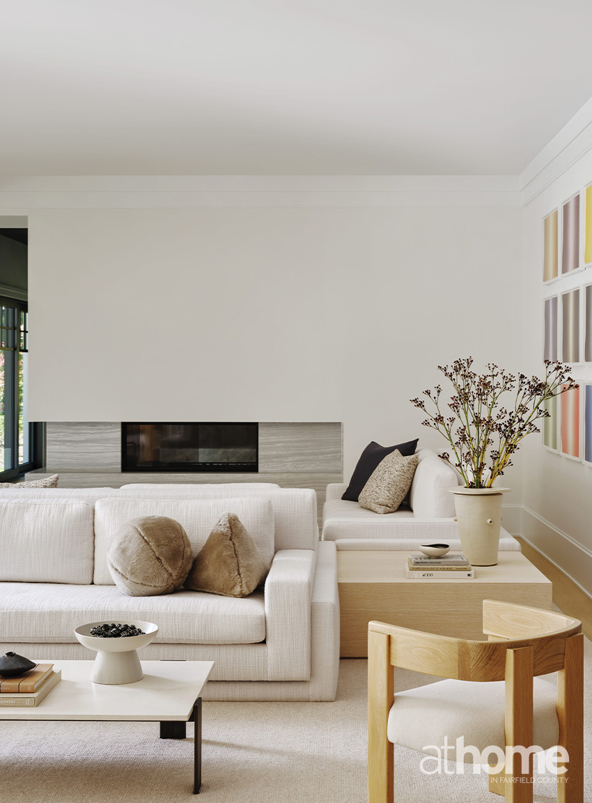
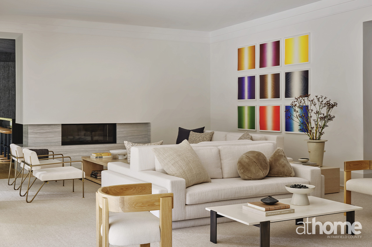
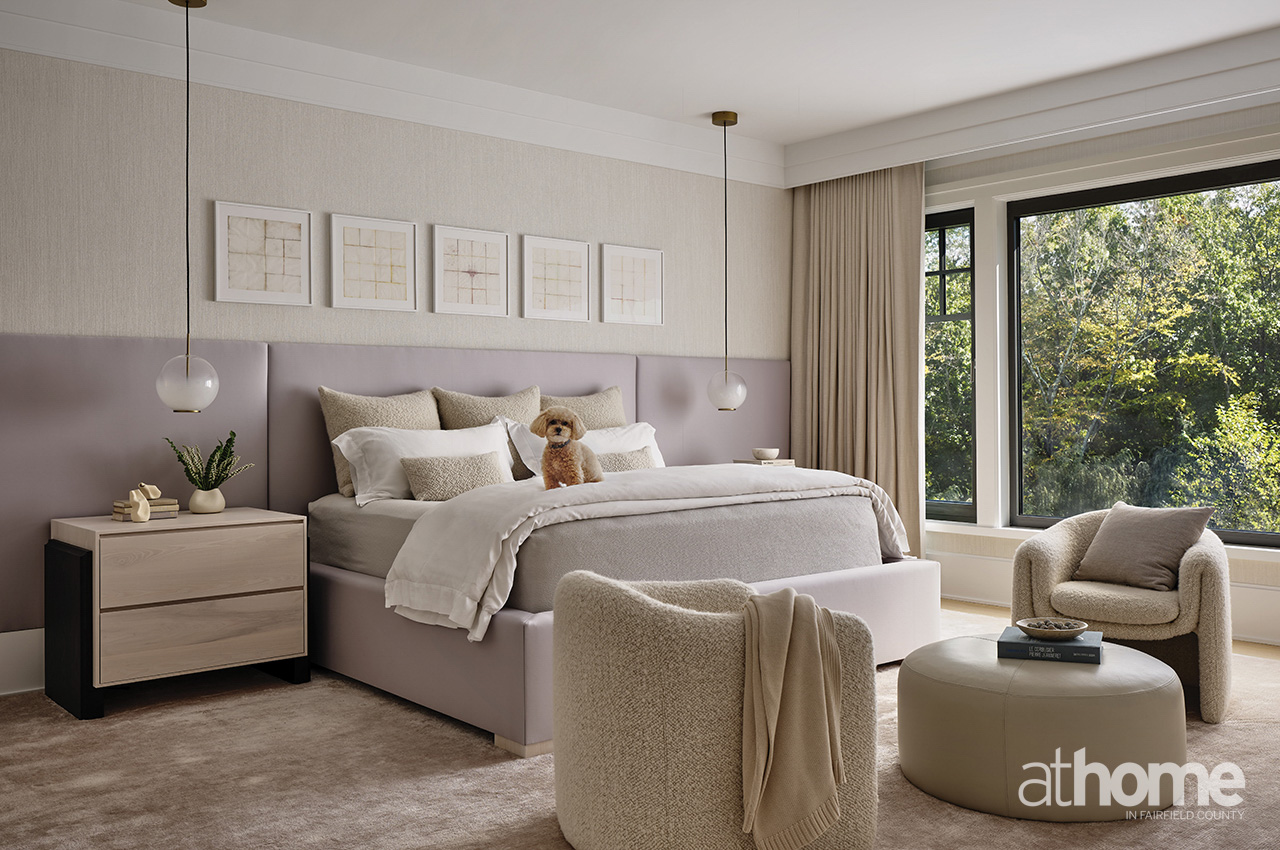
The overall scale was large with spacious rooms and high ceilings. A key element to honoring this scale was incorporating large, oversized windows, which provided a ton of natural light. We decided to lead with the light, directing our general palette by layering whites, creams and beige with textures. We played with large-scale furniture items while maintaining the neutral palette to keep the spaces feeling airy.
Tell us about the kitchen and how the clients use this space.
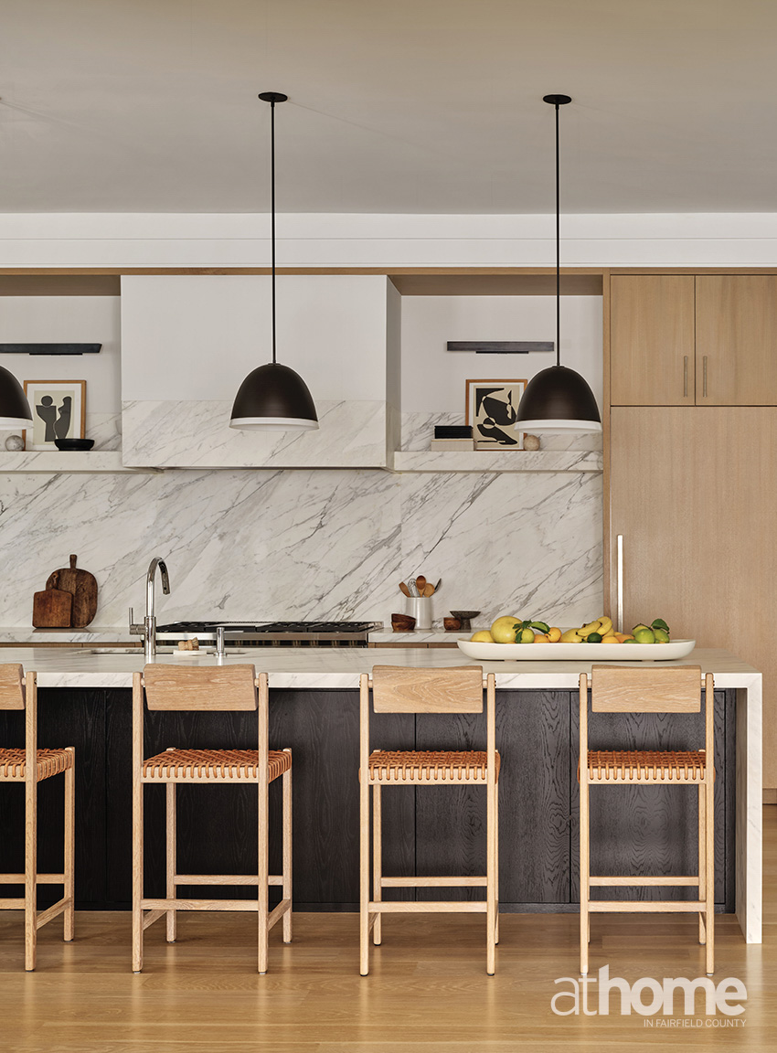
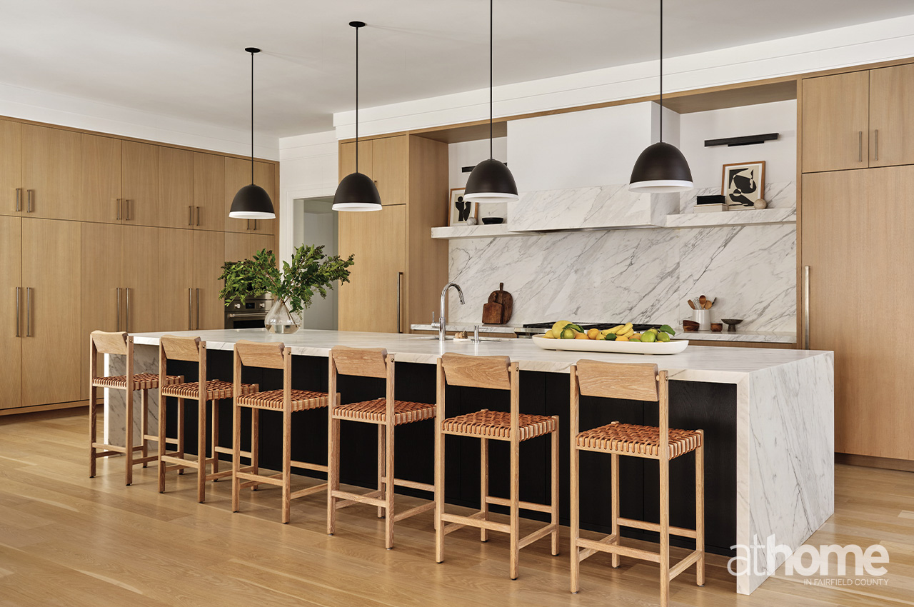
This new build is unique as the kitchen, dining and living rooms are all their own enclosed spaces, which allowed us to individually design each space, yet still with cohesion. I love this kitchen as it’s quite clean, timeless and really focuses on the materials we selected, including veined marble, the braided leather-topped stools and custom oak millwork.
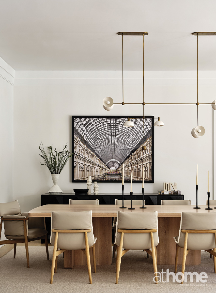
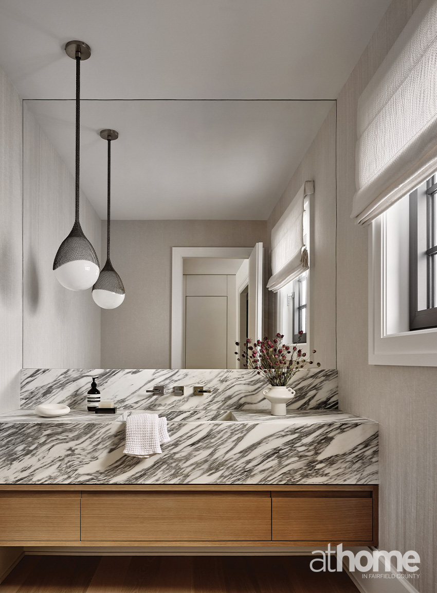
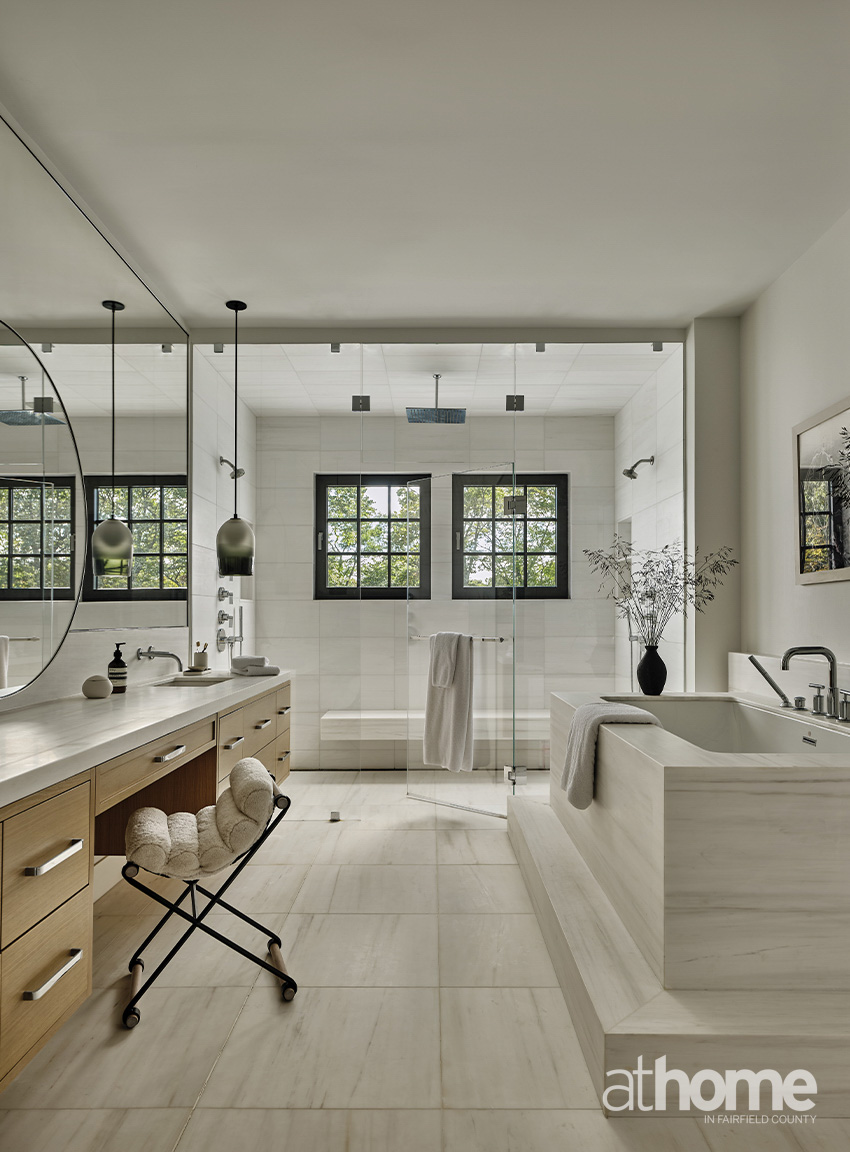
Can you talk about your material and color palette choices for the core spaces: living room, dining, primary suite? Were there signature materials or finishes that became anchors for the project’s overall aesthetic?
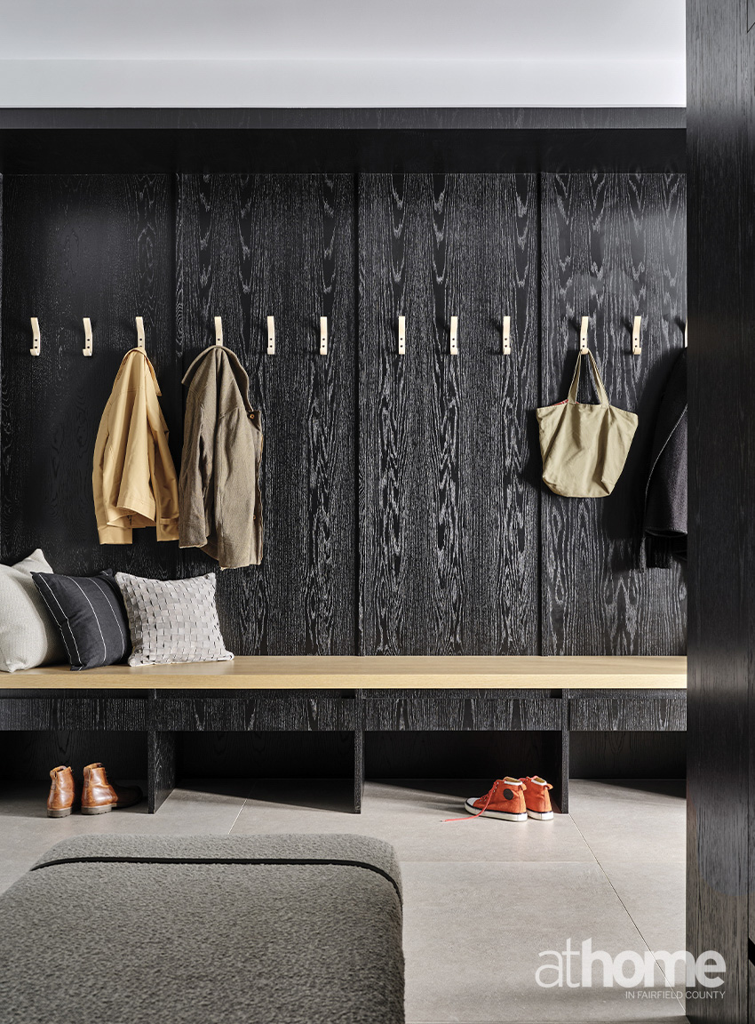
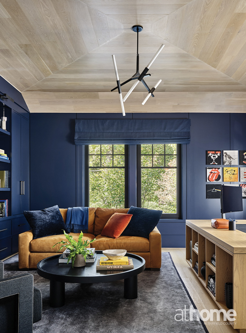
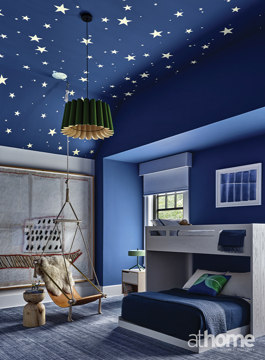
Our color palette was led by the main architectural materials, which were predominantly white oak, white and beige natural stones and blackened steel. We worked on keeping the color palette throughout light and neutral, with accents of black and deeper tones to connect to the architecture in the windows with the black frames and the dark veining in the marbles. The tones in the white oak and white marbles lead the layering of whites and beiges throughout. We chose a few spaces to have a darker contrast, such as the mudroom, study and one of the son’s bedroom to lean into deeper tones of blues and blacks for some color drenching and to create a cocooning effect.
Were there any custom pieces, millwork, or bespoke furniture developed specifically for this house?
Yes, we custom designed all of the millwork throughout the house. Additionally, we custom designed the double-facing sectional sofa in the formal living room, the desk in the study and the elongated primary bed. We worked with our favorite craftsman on commissioned pieces.
How did you approach the integration of art, lighting or accessories to tie the narrative together?
Art and accessories are an integral step in our process. While our furniture, lighting and materiality are the keystone to our design, art and accessories are layering elements that tie a space together. We start with our materials and color palette first and complement and contrast those with the art and accessories. For art, we often are blending client-collected pieces and newly sourced. We knew that for this project, since the palette was so neutral, adding in color and tonal dimension were needed to make the final product not feel one note.
How did function influence design decisions, particularly in daily-use zones like the kitchen and family room?
Most of our projects are for families, so we are very well attuned with the flow and functions that our families need. We always start every project with the needed function and flow of spaces and programmatic needs of the client. We have in-depth discussions with the clients on how they envision using spaces, and we design around those needs first and foremost.
Looking back on the finished home, what moment or detail feels most successful or memorable?
I really loved designing their son’s bedroom. They had personally requested working shades of the blue into the home’s design, which you’ll see drenching the study as well as the son’s bedroom. We went a bit more vibrant in the bedroom; it’s full of personality with a fun fluted pendant, custom sling chair we sourced via 1stdibs and oversized art. It’s a space he can really grow with.
What was one of the biggest challenges on this project?
The timeline was the biggest challenge for us on this project. The family has school-aged children and were relocating to Greenwich from New York. The home really had to be completed and ready for the start of the new school year.
RESOURCES:
Interior Design: Chango, New York; chango.com
Builder: SBP Homes, Stamford, 203-323-2200; sbphomes.com