


above: The ottoman is covered in Pienza Multi by Clarence House and includes the palette for this living room, a mix of warm greens, reds and blues.
Mix Mastered
Playful patterns, a bold palette and plenty of global finds enliven this Darien home
Interview with ELIZABETH HAY, ELIZABETH HAY DESIGN
Photography by MATT KISIDAY
Styling by FRANCES BAILEY


Who lives here?
They’re a young family. They’d recently moved out of the city during COVID and wanted a bit more space. They have two kids now, but at the time they just had one.
The house was a new build, done really nicely, but it just felt quite sterile. It was all white, and they wanted to inject a lot of personality into it and make it feel a lot cozier.
The clients knew your style, but what were their asks beyond adding personality to a white new build?
It really was a bit of a blank canvas, and it was obviously built to a very high standard. There were really nice finishes, and everything was done pretty beautifully, but it just felt very generic.
The wife loved my use of color and pattern and felt that my projects just felt like really cozy homes, and that’s what she wanted to achieve here.
We did that with clever use of wallpapers and paint colors, lots of big rugs. In the bathrooms, the color and wallpapers make such a huge difference.


Did you have a jumping-off point with a color or a pattern to create a palette for the house?
Not really. After a number of meetings with her over Zoom, I flew out there and presented two or three schemes for every room, and it organically evolved from there.
Their brief was for their master suite. They wanted it to feel really serene and not too busy, just very calming with the pale blues and pinks. She already had a mood board that she’d been thinking about for a while, and she’d already done some things to her dining room.


How does your process typically start?
Every client is so different. You know, some clients come to me, and they love what I do, but they also have an idea of what they want for their house, and they’ve put a lot of thought and effort into it already. They have mood boards and things like some specific fabric.
that they might love that they’ve had saved for ages and want to use, and they give me a lot of information. And then other clients, like one I have at the moment for an enormous project, literally just said, “I love what you do. Can you just kind do that [laughs]?” She hasn’t even shown me one inspiration image or anything.
The first thing I do is really build a rapport with the client, and I try and get to know them as well as I can, because for me it’s a bit like giving a present. You need to know someone quite well to give them what they want.

A framed antique textile creates a fun focal point in the nursery. For more pattern, Hay used Peter Fasano fabric on the skirted chair.


Tell us about these bathrooms.
The bathrooms were just white walls, white carpentry, simple gray and white marble. I really had fun with wallpapers and paint colors in there, especially the kids’ bathroom with the window treatments or scalloped shower treatments.
In the guest bathroom, I used that fun Antoinette Poisson wallpaper, which is off that of green bedroom.


Why is color so important to you as a designer?
I just love creating layers and patterns in my projects. Obviously, you can create that through textures as well, but for me, it’s always been color.
I’ve just always been drawn to a lot of color, and I love looking at different color combinations. I love the type of layered interiors that you can keep going with and keep adding to.
I don’t necessarily want someone to walk in and think, “Wow, this is an Elizabeth Hay design.” I want someone to walk into a house and see the people that live there, rather than see me. And I hope I do achieve that.
And I mean, I just dress colorfully. I can still look at very modern, simple, neutral interiors and appreciate them. But for me, they just don’t bring me joy. Color brings me joy.


What are some favorite colors that you’re using right now?
I always love pinks and greens, and I love yellow walls. I don’t turn my nose up at any color. A lot of people are snooty about purple.
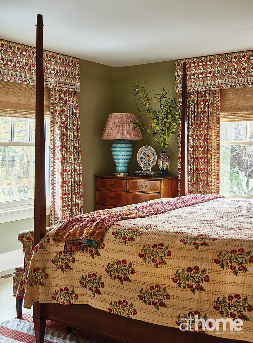
Do you have a favorite room or a favorite moment from this project?
I have to say the guest bedroom is my favorite room, which is the one with the green walls and the Pierre Frey floral Indian fabric. I am slightly biased about that room, because that fabric has just always been one of my all-time favorites.

RESOURCES:
Interior Design: Elizabeth Hay Design; elizabethhaydesign.com
Drapery: Julie Thome Inc., Redding, juliethomeinc