


Photo Ready
A photographer turns her lens inward, reimagining her historic fairfield home with the help of designer friends
INTERVIEW WITH Michelle Morgan Harrison, Morgan Harrison Home & Melissa Lindsay, Pimlico Interiors by Melissa Lindsay
PHOTOGRAPHY BY Jane Beiles
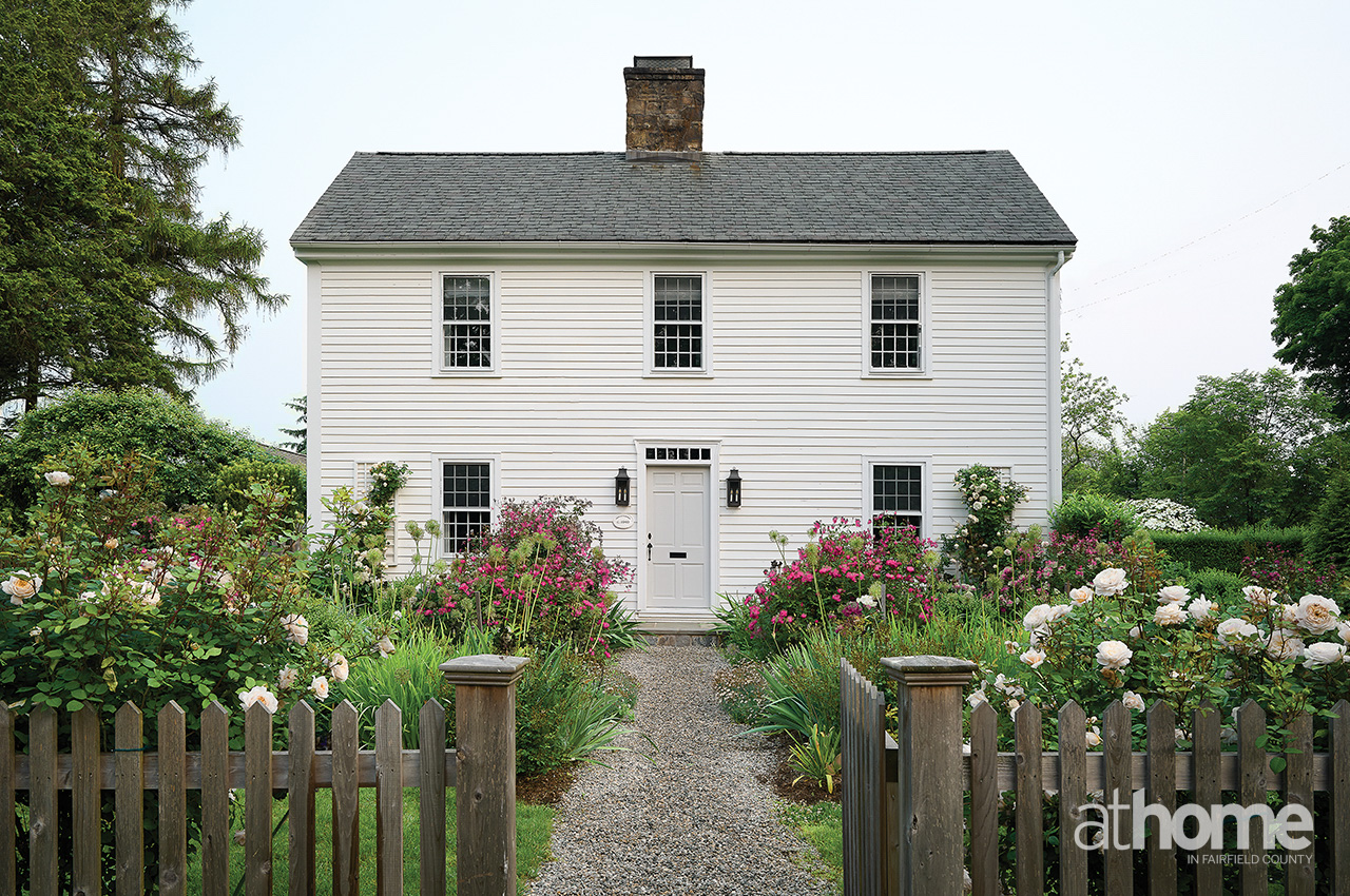
The 1940 saltbox home, originally designed by C. Cameron Clark, is set within gardens lovingly brought back to life by Jane’s husband, Paul.
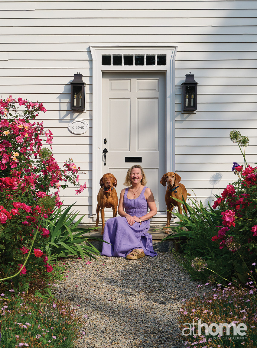
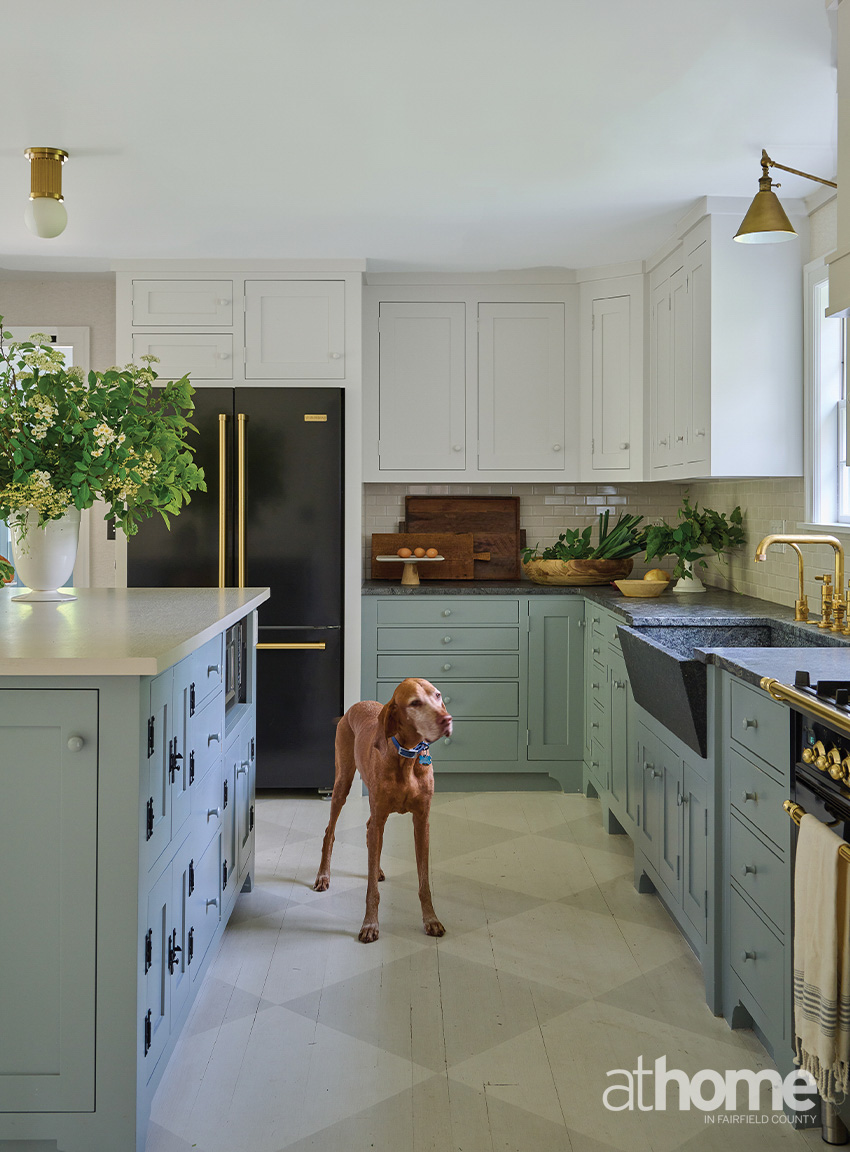
Beloved Vizslas, Otto (left) and Quinto (right) join Jane on her front steps.
TELL US ABOUT YOUR BACKSTORY IN TERMS OF HOW YOU MET AND YOUR WORKING RELATIONSHIP.
Michelle Morgan Harrison: I believe it was back in 2012. Jane’s best friend had hired me upon her recommendation (although I hadn’t met her). When it came time to shoot the project, the client recommended Jane. I was still in the early phase of my career and had been using the same photographer but saw something feminine in her work that I liked, so we connected and I booked her. The rest is history. We have shot together consistently ever since, and I consider her a good friend!
Melissa Lindsay: I had a shop on Elm Street in New Canaan when she was getting started as a photographer. We started doing some shoots in the shop, and we got to know each other, being part of the design community. When she moved closer to town (in New Canaan), I came on board as a designer and worked with her for a few years in creating those spaces.
I live in Fairfield, so when she bought the house here, it was exciting for her to be in my neighborhood and was a nice full-circle moment.
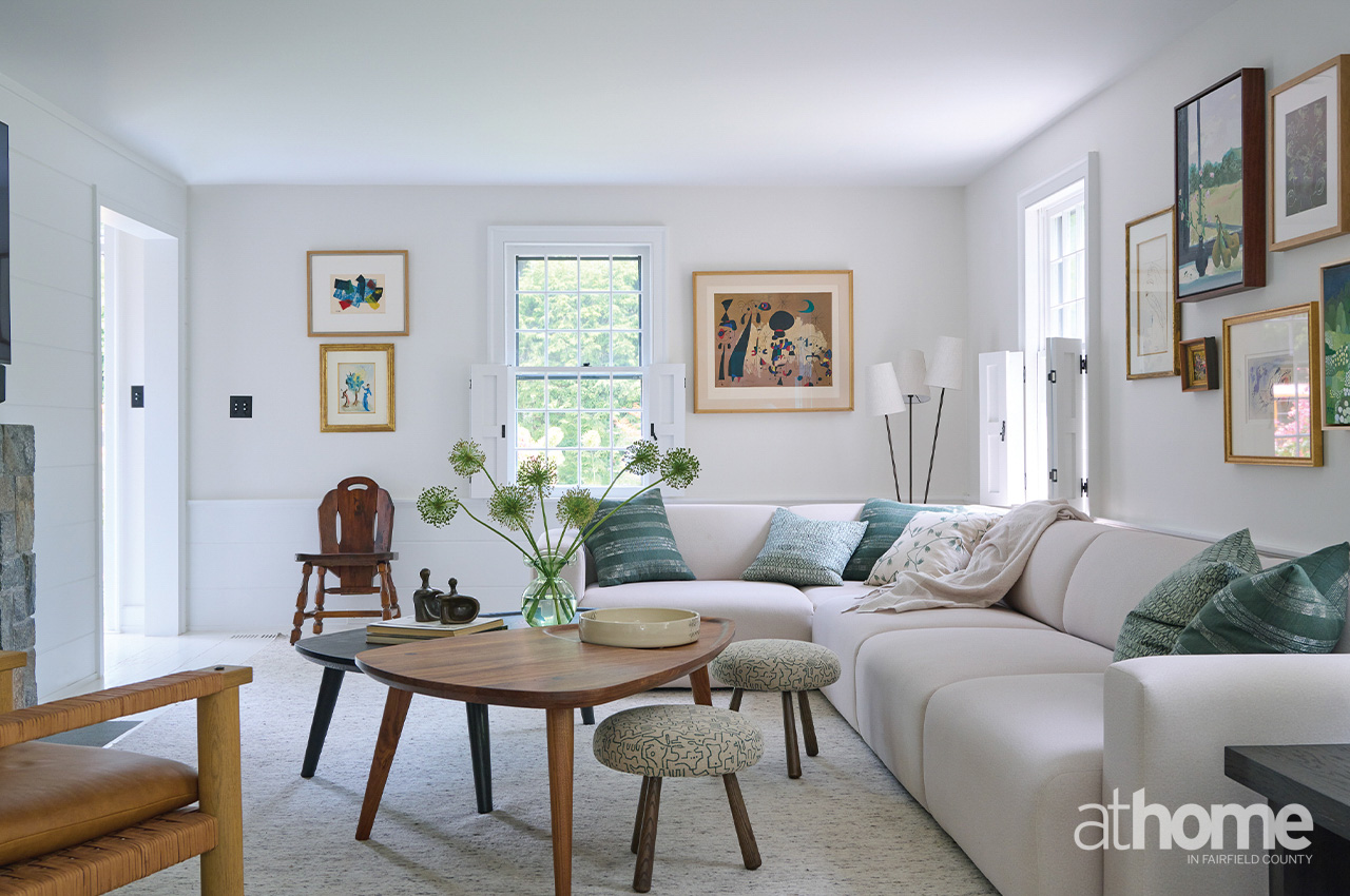
Working from Jane’s directive, Melissa Lindsay delivered a custom sofa to seat the Beiles family comfortably. Stools provide both a place to rest your feet and flexible extra seating.
WHAT WAS THE SCOPE OF YOUR WORK HERE?
MMH: I did the majority of the house with the exception of the living room.
I came in early on when they were purchasing it and worked on changes to the floor plan. We created a new powder room, laundry room and the mudroom. We created new built-ins in the living room and redid the bedrooms and bathrooms upstairs. The kitchen was paint, wallpaper, lighting and she used her existing furniture for the dining space. We chose all the wallpapers and the paint colors, including the exterior colors.
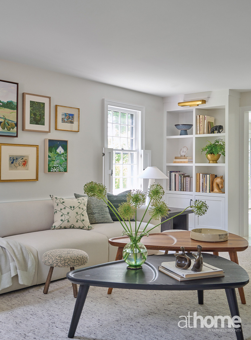
Jane was most excited to map out space for her treasured art works. Coffee tables by Fernweh Woodworking provide additional surfaces for displaying collectibles.
HAVING RENOVATED YOUR OWN HISTORIC PROPERTY, WHAT ARE THE BIGGEST ADVANTAGES—AND THE TOUGHEST LIMITATIONS—OF WORKING WITH A LANDMARKED OR OLDER HOME?
MMH: There’s a lot of back and forth with the historical review committee, which can be challenging and frustrating. The ceilings are also always pretty low (laughs).
The most fun part of the challenge is creating functioning spaces from old spaces that used to have a completely different function, when life was different. There were no laundry rooms, or at least not in the way we want them now. Or sometimes there’s an existing bathroom with a washing machine in it. I knew we we’re not doing that. We wanted to give her a proper bathroom.
We were focused on keeping it authentic, but still making it feel fresh.
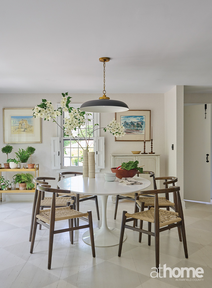
A Visual Comfort & Co. pendant hangs over a Saarinen table in the dining space. Neutral texture comes via a Phillip Jeffries wallcovering, complemented by a subtly painted floor pattern by Shelly Denning.
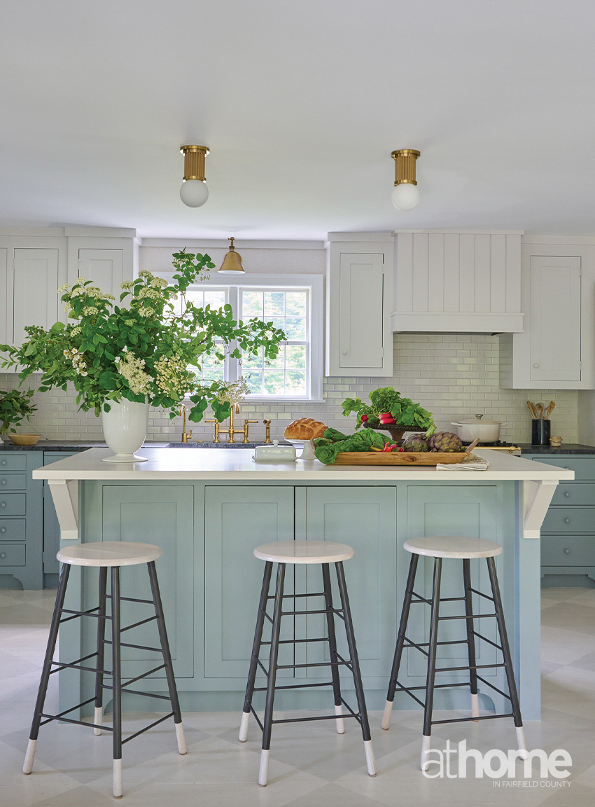
Two-tone oak and black metal stools by Michele Varian line the island.
The original cabinets were refreshed with new Benjamin Moore paint: Silver Satin on the upper set and Mount Saint Anne below.
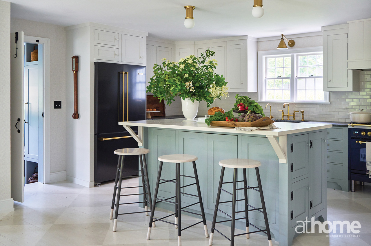
Brass fixtures by Urban Electric Co. (island) and Visual Comfort & Co. (sink) introduce a warm metallic note.
WAS COLOR ALWAYS PART OF THE PLAN?
MMH: Yeah, absolutely. She wanted color. She wanted interesting.
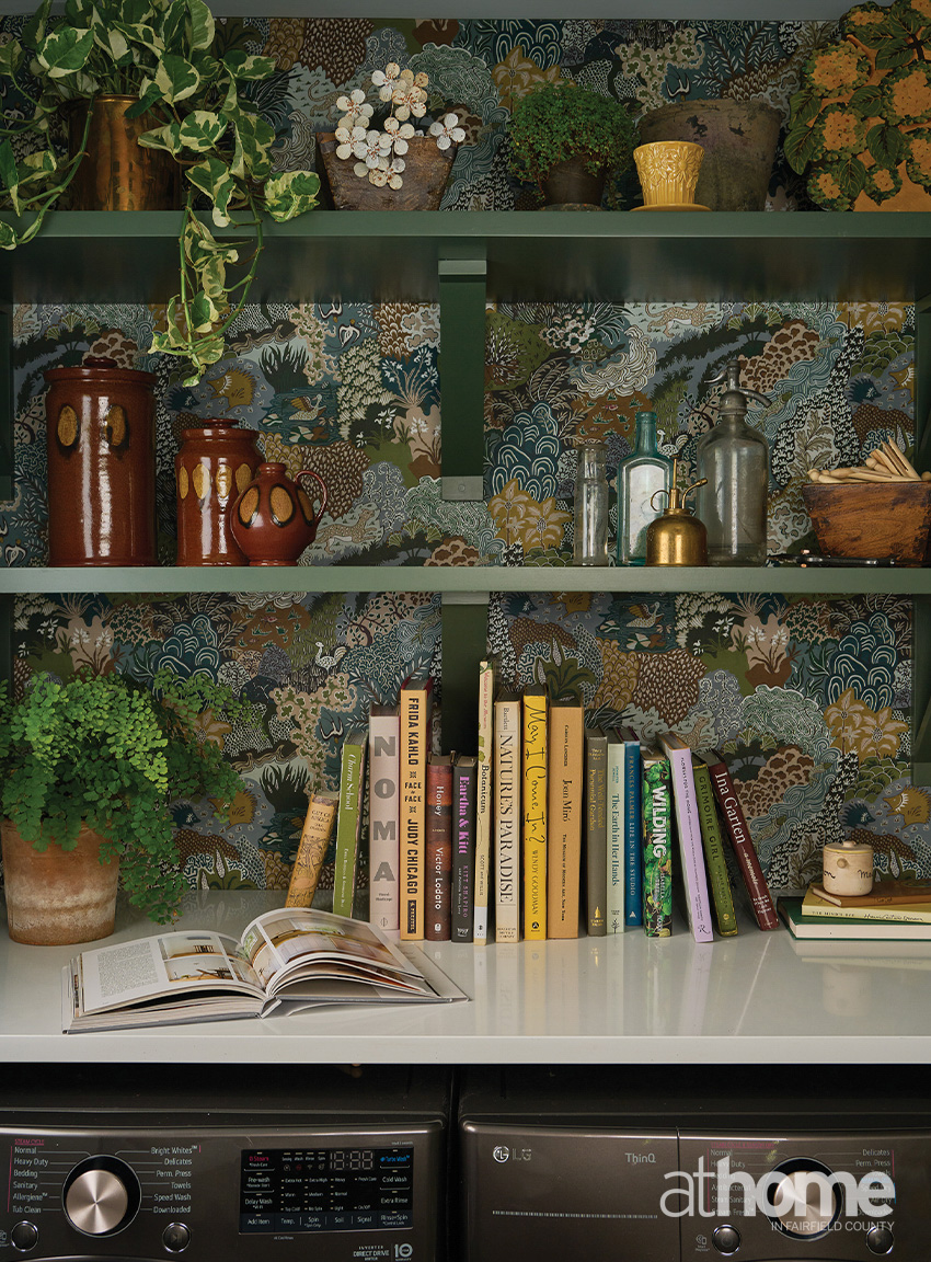
We had lots of fun working on the wallpapers, which dictated the rest of the rooms. We started with the papers in key paper rooms: the mudroom, powder room, laundry room, and then the daughter’s room and the primary bedroom.
We knew we wanted the terracotta tile in the mudroom. And then we did a lot of clé and Fireclay tile everywhere.
YOU DIDN’T STRUCTURALLY CHANGE ANYTHING IN THE KITCHEN, BUT TELL US ABOUT THE CHANGES YOU DID MAKE.
MMH: We painted the floors, we painted the island. We got new appliances and did new electrical. She really wanted to keep the island and just make it more useful, so we just worked with it.
THE PRIMARY BEDROOM IS SO FEMININE AND PRETTY. TELL ME ABOUT WHAT SHE WANTED YOU TO DELIVER FOR HER IN THERE.
MMH: She wanted a canopy bed and was very clear on what she wanted it to feel like. So, it was just a matter of how to articulate that. For the wallpaper, she wanted something moody and mural-like.
MELISSA, YOU TOOK ON THE LIVING ROOM SPACE. TELL US ABOUT YOUR PLAN THERE.
ML: She had brought over the pieces from when we did her living space in her old house, which we’d chosen over a decade ago. They just weren’t working in the room, and they weren’t maximizing her functional needs for the space. We were able to keep the dining table and chairs, though.
We just wanted to start fresh. The aesthetic, the language of the home had been identified and developed with the work she did with Michelle, but I took a slightly different approach in the living room. I wanted it to be more simple, with mostly primitive elements, especially when the other spaces have more color.
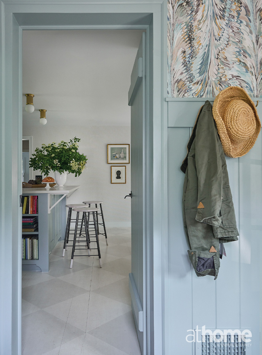
Benjamin Moore’s Mount Saint Anne continues into the mudroom, where similar hues appear in a marbleized Lee Jofa paper.
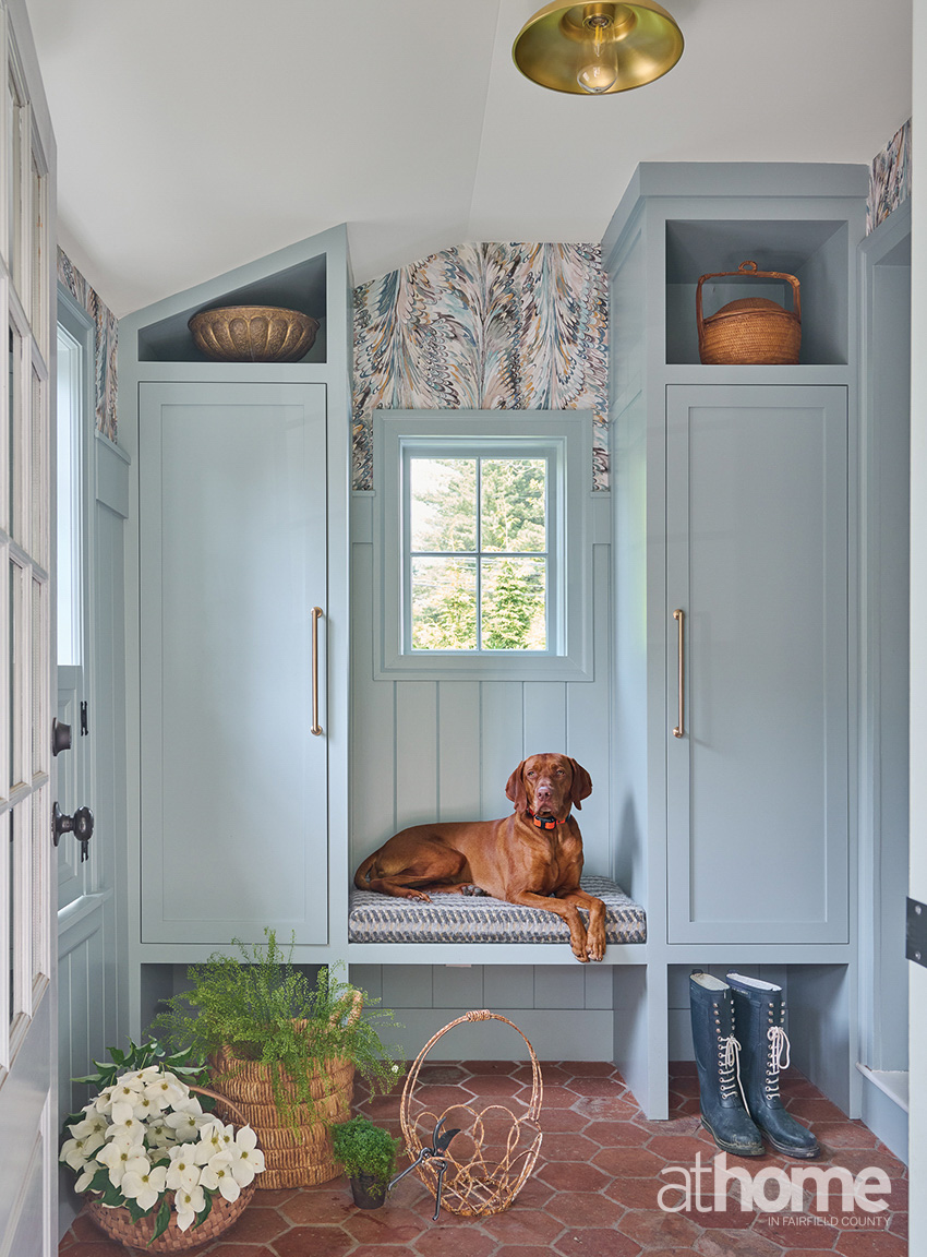
Otto poses on an Osborne & Little upholstered bench integrated into the mudroom built-ins, where antique terracotta tiles by clé balance the muted blue palette.
One of her first requirements for the space was to just really be able to comfortably fit her whole family for lounging and watching TV. That was the starting point for thinking about the layout, and that was what drove this large custom sectional, to really fit the space well and not be overwhelming. I wanted to bring in some vintage, and I wanted to bring in some wood tones and linens and keep the fabrics and the patterns pretty simple. There are still some botanicals in there with the pillows and the pouf fabric, and we went a little more midcentury with some of those patterns.
I also love the focal point of the coffee tables we used, mixing them with in with the stools. I think when you have that big of a seating area, it’s nice to have a cluster of items that can be moved around or use the stools to put your feet up. It’s not just one monolithic table, and in a smaller space it just creates more interest.
We found that funky little vintage side chair that you can see against the wall. Pieces like that, help build layers in the room and give it soul. This house already has so much soul and presence, and they’ve done such an incredible job with the outside. It’s such a gift to us in the community to be able to have that beauty on the corner now.
DID YOU HELP SOURCE THE GALLERY WALL?
ML: From day one, she was so excited about doing an art wall and bringing in and finding art. We kept the room simple so that the art could be a fun way for her to bring in more of a design element and color and pattern.
The art is a mix of old and new. She has some great pieces from her old home, and it was fun to find new homes for them here.
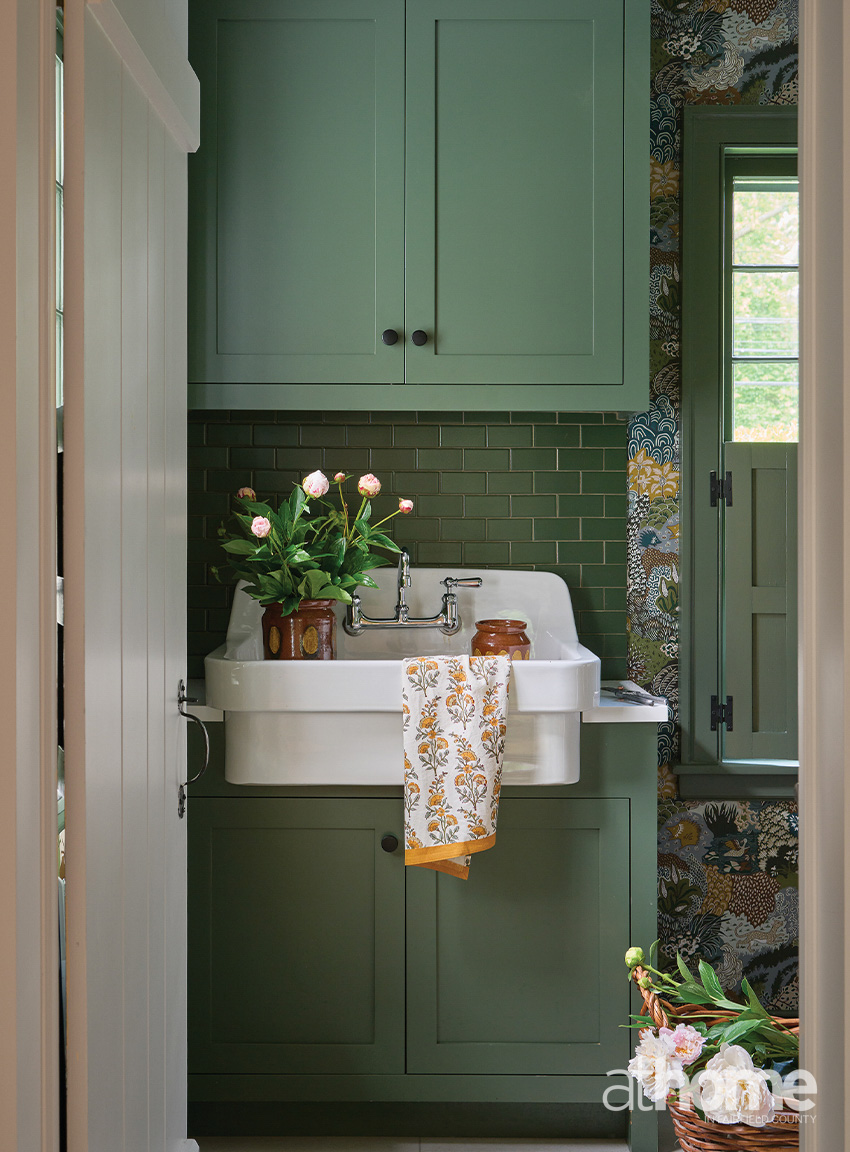
A Rejuvenation utility sink is mounted against a wall of green Fireclay tiles in the laundry room.
Josephine Munsey’s Whimsical Clumps brings pattern to paper and pulls from the room’s Benjamin Moore Vintage Vogue paint.
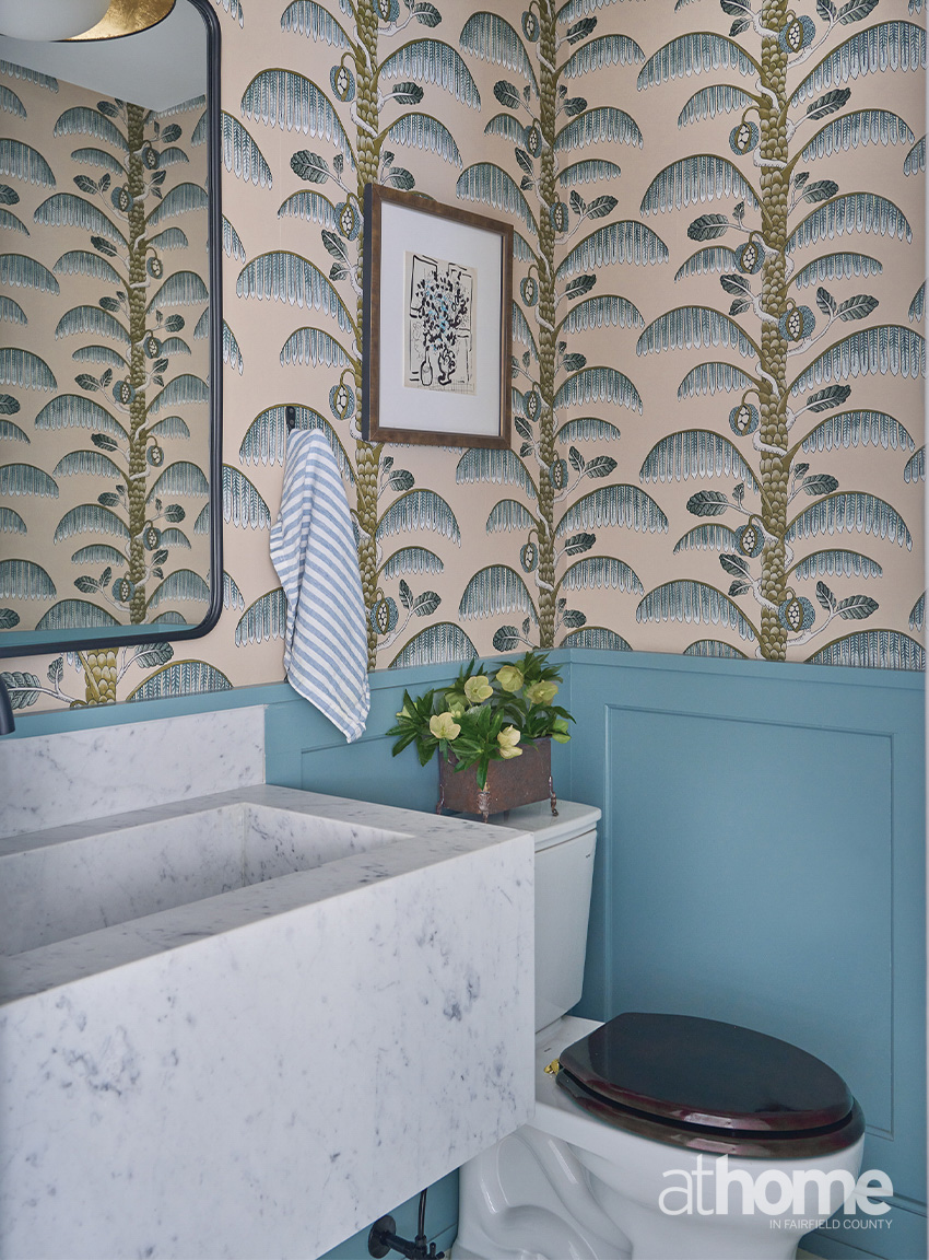
Palm Stripe from Kravet Couture appears in the powder room with Oval Room Blue, a deeper shade from Farrow & Ball.
DO YOU HAVE A FAVORITE SPACE?
MMH: The laundry room. I love the backsplash with the wallpaper and cabinets. My second would be the mudroom. That’s really your entrance into the house, so that was important to get right.
WHAT COLORS ARE YOU LOVING RIGHT NOW?
MMH: I still love every shade of the greens. But right now, I’m really into this pale butter shade. I like to pair it with pale salmon and creams, or it can have a pop of more cinnamon and walnut. That’s my favorite fresh palette.
ML: I’m working on a few projects where I’m really having fun with color and exploring the burgundys and reds. I get excited by very interesting color palettes and colors that mix together. Whether it’s the right mauve with a certain berry color or the right pistachio. I love historic colors.
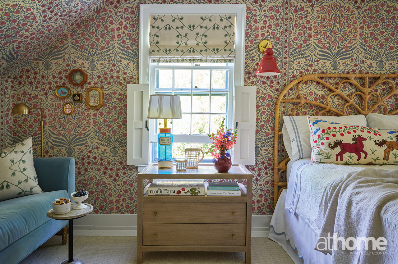
In her daughter’s bedroom, florals from Lee Jofa’s Sameera wallcovering introduce reds as another pairing for blue. The lamp is adapted from a pair of vintage French glass apothecary bottles by Jane’s godmother, interior designer Judith Prus.
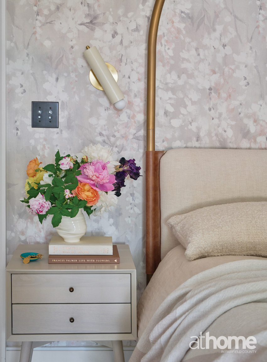
The primary bedroom is wrapped in Wisteria Pearl paper by Rebel Walls. Jane enlisted help from Frances Palmer to style the florals on her bedside table.
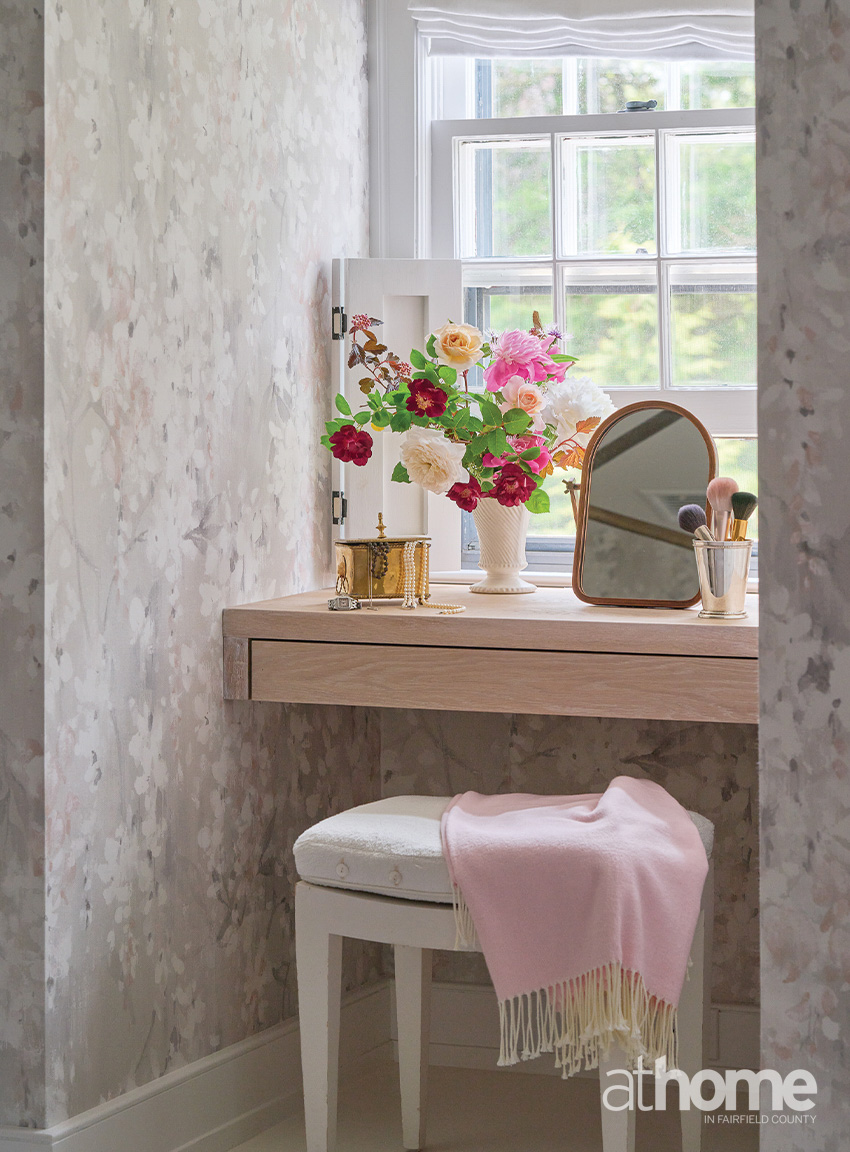
A custom floating vanity benefits from the natural light in the window niche.
RESOURCES:
Interior Design:
Morgan Harrison Home, New Canaan, 203-594-7875; morganharrisonhome.com
Pimlico Interiors by Melissa Lindsay, Westport,
203-972-8166;
pimlicointeriors.com
Builder:
Ludwin Godoy, LG Home Improvement, Fairfield, 203-223-2712; @lghomeimprovement_ct
Decorative Paint: Shelly Denning; @shellypaint
Florals: Karen Legan, Lemon Dahlia Flowers,
203-260-7886;
lemondahlia.com