Less is More
A streamlined vision for a Weston farmhouse marries clean lines with European tradition
INTERVIEW WITH CHRISTINE STUCKER, STEWART-SCHAFER // PHOTOGRAPHER SARAH ELLIOTT

Who lives here? They’re a lovely family who moved from Brooklyn. The parents are both therapists, with young kids. They bought the house, and we started work right away, with a tight timeline.
What was your first impression when you saw the house? We walked through, and there were so many entrances and unnecessary staircases. The kitchen was overwhelming, but I could already imagine where we could go with it. There were some good elements, but we really had to strip so much away and remove so much excess and confusion to bring it to its glory. The clients were great, because they gave us full creative reins.
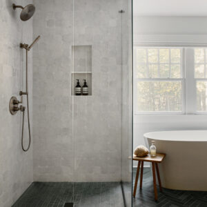
What was the scope of the project? It was pretty much a gut. We redid the floors throughout and painted the entire house inside and out. We redid one staircase and removed another, added some windows, changed the main entrance. We redid the bathrooms, all the bedrooms, all the fireplaces. We really changed the program of the space. We touched every surface in that house.
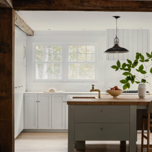
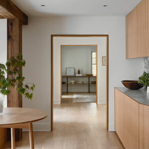
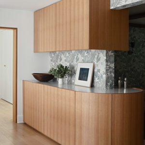
Tell us about the kitchen. They have a big family, and they entertain a lot. There was the space and opportunity to create this huge island (the original layout included a massive triangular island). We got rid of everything, down to the studs, and then built custom millwork. We gave them multiple sinks, a bar and the butcher block island. We wanted it to feel very European. This house had Dutch undertones, and we’ve spent a lot of time in Amsterdam. I think that was a major influence for the design, going for that European farmhouse vibe. I didn’t want to do a tile backsplash; I really wanted it to look timeless and feel like it really could be a 100-year-old kitchen. I thought about what materials they would’ve been using, all while modernizing it but still looking classic.
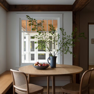
And we wanted it to flow really well. When you’re in the kitchen, you get a hint of what’s to come in the dining room with that amazing wallpaper. We created the circular bar that divides the dining room from the kitchen area. It was heavy on the custom cabinets throughout the house. We changed the entire storage situation, knowing they have kids and a ton of stuff.

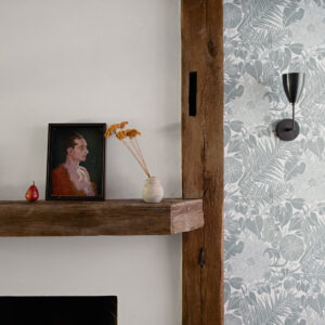
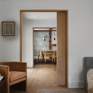
You mentioned that wallpaper in the dining room. How’d you choose that? I’m obsessed with the woman who makes it. Her name is Marthe Armitage. She’s an older British woman who makes these prints. I think it’s so beautiful. I’m not a big wallpaper fan, but when it makes sense, it’s such an “Aha” moment. The dining room felt very much like an afterthought in the original plan. It was not inviting, so we wanted to make it a destination space. We redid the fireplace, added new lighting and the wraparound bar. We also put the paper on the exterior beam, so it gives you a peek of what’s happening in that room.
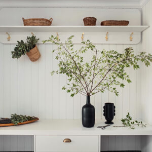
So much of this house was about removing and editing what was there before. What was that process like? It’s similar to how you get you get dressed, considering all the accessories. For me, it’s about finding the main focus of the space, and then you’re guiding the eye through that. I get stressed in overly cluttered, overly embellished, overly decorated environments. It’s not relaxing to me, or kid-friendly. We wanted this house to feel clean, usable and uncomplicated.
We exposed the beams and worked from there. The whole house felt so dark when they bought it, with too many genres and materials that were competing. We brought in all that natural light, lightened the wood. And throughout the house, we kept the same palette. When you go up the primary bathroom, that tile ties back down to the wallpaper, and the wallpaper has the same tone as the kitchen cabinets. We really make an effort to make the whole house cohesive. We want that vibe to be consistent.
What was the biggest transformation? It would probably be the kitchen, where the original cabinets where a bright blue. Now, it’s one of my favorite kitchens that we’ve done to date.
What was your favorite part of the project? The clients really believed in us. We spent a lot of time in the house, really listening to what it wanted to be. You could see the story of where it could go. For me, I could envision in my mind where this house should be, and I feel like it completely landed on our vision and what we had hoped for it.
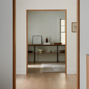
Another thing that was awesome is that they let us furnish it and decorate, from the rugs to the art. It really made it all come together. The furniture really needs to complement the environment and vice versa. We mixed a lot of old and new. The light fixtures in the kitchen are vintage. And the materials throughout the house were important. I used a lot of unlacquered brass, and we wanted these imperfections, and that patina, so things could age with the house and everything has its own personality. It was all about those little details—like the custom reveals around the doorways—that make such a difference and really elevate the space.
Professionals: Stewart-Schafer, Easton, 718-522-2508; stewart-schafer.com

