Personal Style
After 20 years of helping others with their interiors, designer Caroline Kopp gets to imagine her own dream home
INTERVIEW WITH CAROLINE KOPP, CAROLINE KOPP INTERIOR DESIGN // PHOTOGRAPHERS LAURA MOSS & JULIA D’AGOSTINO (portrait)

Tell us a little bit about your gorgeous home.
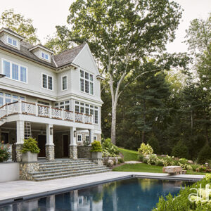
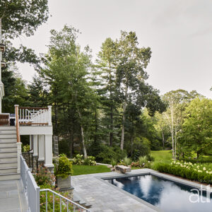
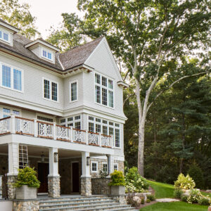
We bought the property in 2017 and moved in the summer of 2019 with our two young kids. We love Westport and adore this location. It’s been a great home for us and a beautiful place to host friends and family.
What’s your favorite room in the house?
My living room. I know people love to congregate around a kitchen island, but I love drawing people into this feminine sitting room. It’s meant to be a place where you relax, connect, and just enjoy the soft lighting and adult conversation. I wanted this room to feel like you’re in Paris with the custom mantel as the focal point. It was hand chiseled in Ireland and has an organic feel. The room has paneled walls and a heavy crown moulding, which adds a little formality, and I love our gas fireplace, which evokes ambience with the flip of a switch. Other features are the sateen curtains, which have a little box pleat under the hem and hang on custom polished brass poles. They go a long way to create a luxe softness and polish in this room. The floor is a beautiful herringbone, and I layered some hide rugs on top of a larger oyster colored one, because I love tone on tone and different textures. A brass coffee table found on Chairish offers a little ’70s moment, and my Art Nouveau chandelier is from 1stDibs. It’s made of hundreds of little light milk blue glass straws hung from chains! I have a mirror collection and need to have them in every room. The one in here is églomisé—a technique of applying silver leaf to the back of glass. It’s distressed, and I love antique glass.
How would you describe your overall style?
When I thought about how to decorate our home, it was psychological. I wanted it to feel like an escape from the day-to-day routine, yet also invoke that feeling you get when traveling—getting to experience something exciting and stimulating while still feeling comfortable and welcomed. I employed a glam factor in my living and dining rooms for this exact reason—it gives a sense of being transported somewhere. The other theme that’s a thread throughout our home is a 1920s pre-war vibe. I’m obsessed with that era, and much of my design incorporates modern elements into this type of traditional architecture.
How did you fall in love with this time-period?
I was lucky to work for Thomas O’Brien for eight years, and he draws a lot of inspiration from vintage and always pulls in a pre-war flavor to his work. I’m originally from Wyoming, so when I started working in New York I was exposed to many pre-war co-ops and was attracted to all of the old-school architecture.
Two components I love from that era include fancy millwork and different paint finishes. Back in the day, the original two paint finishes were what is currently high-gloss and matte, and you only used shiny paint on areas you would touch, like cabinets and baseboards. Flat paint was used only for ceilings and walls. These days, there are so many different gloss levels for paint that can help evoke a mood in a room.

Tell us about this lovely kitchen.
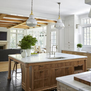
I had some fun with this room and nicknamed it “the luxe scullery” because I wanted to feel like I was cooking in an English estate! I aimed for an older feel with details like irregular Belgian bluestone floors, and I was big on concealing appliances so you could focus on my French Lacanche range. It’s a low-tech stove and oven from the oldest enamel company in France that predates the French Revolution. The cabinetry was very intentional and each set of cabinets have a different door profile. I finished my perimeter cabinets in cerused white oak, a timeless, luxurious finish that I love. The other cabinets are painted in high-gloss White Dove.
Because we built from scratch, we were able to make symmetrical clean elevations like the area around the stove. There’s a doorway on either side and then the range in the middle with a curved limewashed hood, and this symmetry is so harmonious for the eye. As you look at the stove, the right side is a wall of cabinets where the fridge is nested. I have a set of flipper doors that open and nest back and tuck away. That’s where I have my breakfast station with coffee, a toaster. It’s really like a scullery—a wall of cabinets that conceals something.
The island is birch, has a honey brown finish, and was inspired by the visual idea of a table in the middle of the room. It has detailed tapered columns, inspired by Steven Gambrel who does a lot of beautiful millwork. I love how my pendants—sourced these from High Point, NC—turned out over the island. They’re polished stainless steel, brass on top, and the bottom is frosted glass, so they look slightly industrial. They cast the perfect soft light that offers relaxing vibes.
On the island and for the range backsplash, we used Calacatta Caldia, which I chose for its green undertones. The backsplash is polished, which allows more of the color to come through, and the countertop is honed and more muted. On the side counters, we used Caesarstone quartz that’s intended to mimic limestone. I love it, but contrary to popular belief, it does actually stain. My advice would be: If you’re doing a kitchen and really want marble—get it! There’s no stain-free stone, and if you find a slab that gives you an emotional experience, it’s like artwork and will make you so happy.
Tell us about this dramatic dining room and butler’s pantry.
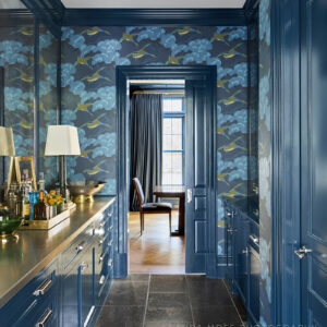
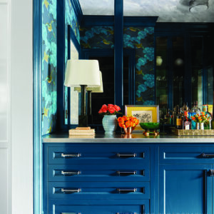
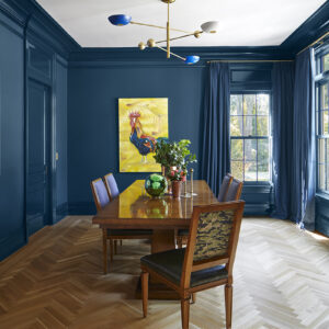
The moody Hidden Sapphire by Benjamin Moore wall color sets the tone. The table is an art deco shape, and the brass chandelier is an Italian mid-century modern style with blue accents. I covered the seats of the Louis dining chairs in bottle green leather and used two different fabrics for the chair backs and an indoor/outdoor fabric for the fronts to ward off stains. The room is grounded by exposed herringbone white oak floors and abuts the butler’s pantry, painted in the same blue color. I chose a fabulous whimsical flying duck wallpaper by Lee Jofa, and the stainless steel countertop shows years of use, which I love. Markings like this mean that you’re living and life is happening there. I found a pair of table lamps from Fairfield County Antiques and Design Center that supplements the overhead light and emits relaxation vibes. Large panels of antique glass are the perfect backdrop to this little gem of a room.
Many designers shy away from color. What’s your feeling about using hues in a home?
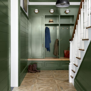
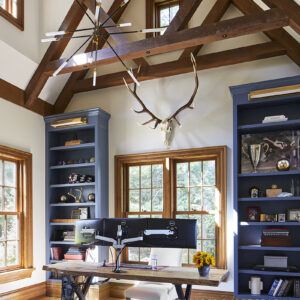
I love blues and greens. Since we have a home with several rooms, we get to have different experiences in each space. The central area towards the back of the house is painted white, so there’s plenty of serenity there. But then there are pockets of color in the living and dining rooms. I love being surrounded by beautiful color, and I pored over tons of samples to get the right shades for these spaces. In the living room, we added white to Benjamin Moore’s Cumulus Cloud to make it more powdery and set a soft tone. Our mudroom is an olive green, which we made more dramatic by painting all the trim and shiplap in the same green. Above that, the wall and staircase is white to balance everything out. In my husband’s office, he has two blue bookcases to balance out white walls, so overall I feel like there’s a good mix of nice clean white rooms and colorful zones.
Interior Design: Caroline Kopp Interior Design
Architect: Michael Smith Architects
Builder: Tiefenthaler

