


The Lovely Bones
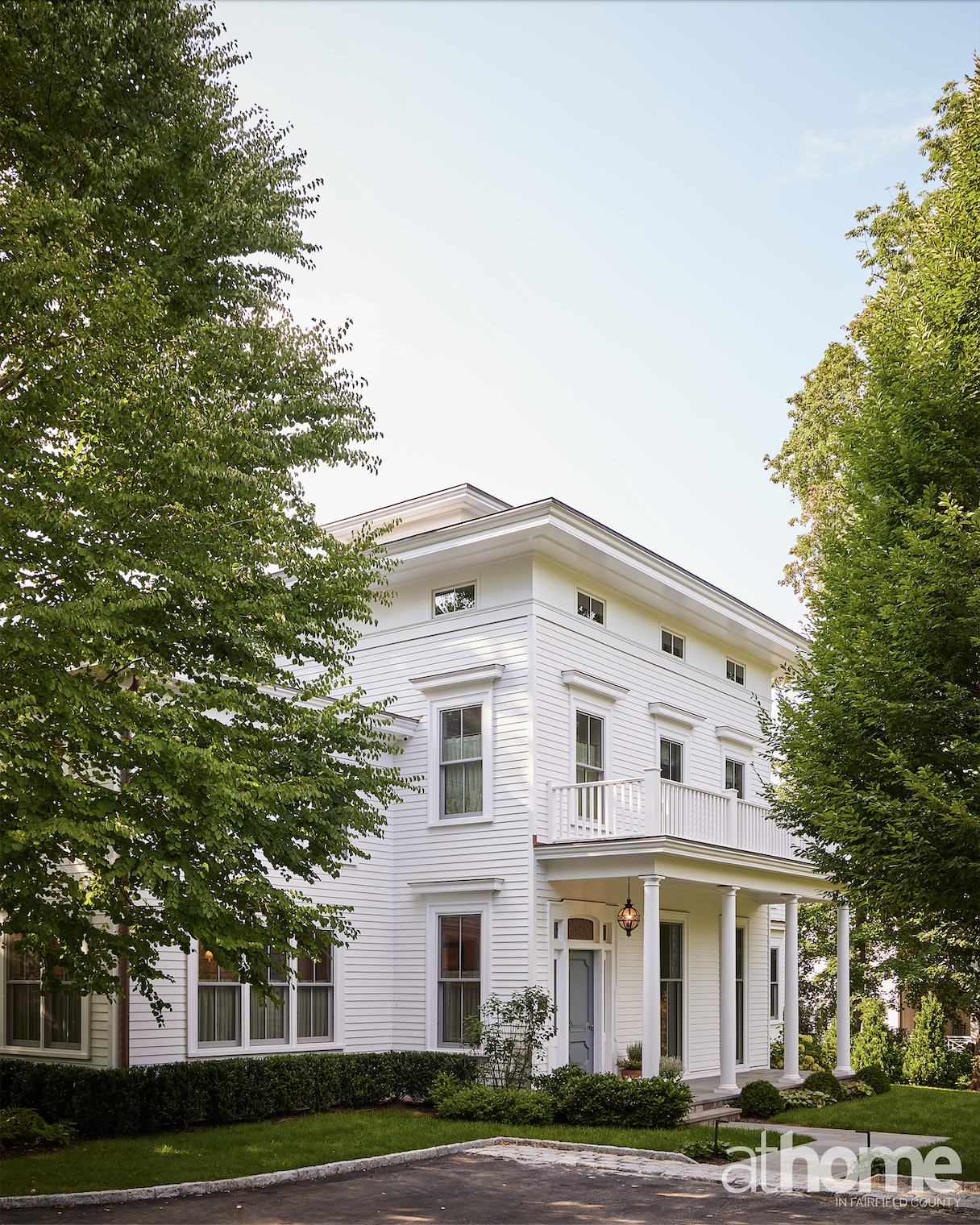
An architectural gem is updated with papers and paint
INTERVIEW WITH NINA CARBONE, NINA CARBONE INC
PHOTOGRAPHY BY KATE S. JORDAN
STYLING BY MEGAN AVEDESIAN
Who lives here?
It’s a family that bought the house during COVID, sight unseen. The home was renovated in the ’90s in certain places, but it wasn’t aesthetically amazing. It didn’t necessarily function well, just because of all of the piecemeal renovations.
They got to live in it for a while during COVID, before signing on with an architect, and then I came on board. They had a lot of time to be really thoughtful about the layout and how it worked for their family, which includes two daughters.
The wife loved the idea of not making it a huge wide-open space. She liked separate rooms, because I think their previous home was more open. They were ready for something that felt a bit more traditional in terms of the organization of space.
What sort of architectural changes did you make to the interior?
We knocked down a whole section of the back of the house that was added on in the ’90s, added a second stairway in the back of the house, added a family room, added a kitchen and actually dug out a basement. In terms of percentage of the house, we probably added about 30 percent to that total.
Is all the beautiful molding original?
The plan was to keep as much as we could and mimic for the newer portion, because it was original Italianate molding. The house had beautiful bones, and we wanted to make sure that we were true to that in a considered way.
What were their asks for the design? How did they want this house to feel for them?
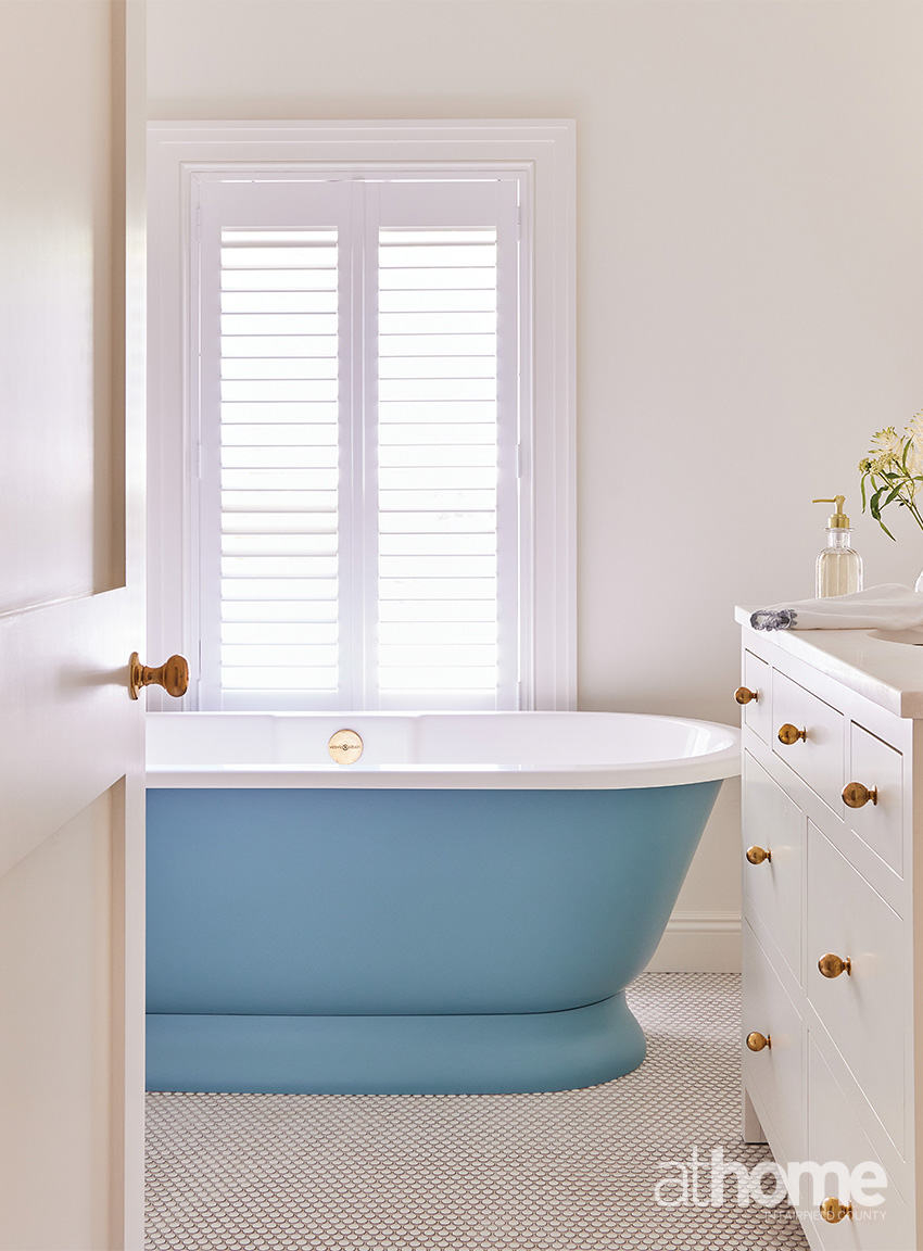
She was a wonderful client and only wanted us to show her things that we liked, and we had a long introductory period with the family prior to them signing on. They had looked at a bunch of different homes that I had done, and she liked color—especially blues—but didn’t want it to be overwhelming.
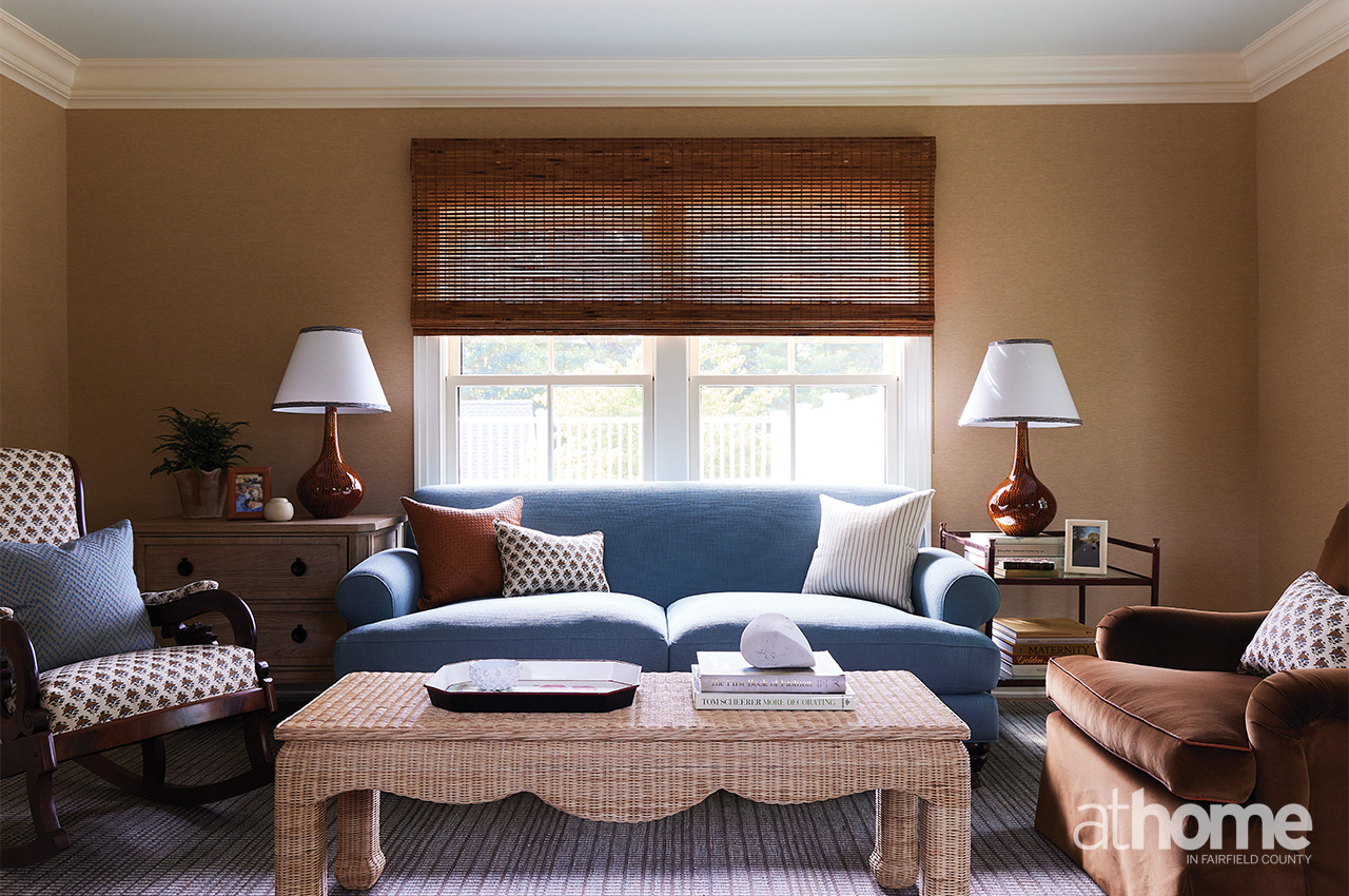
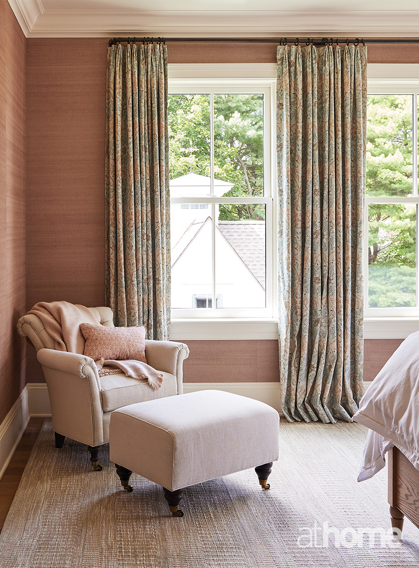
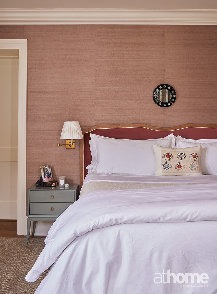
She really wanted the rooms to flow, and she wanted them to have a softness to them, because the light in certain rooms, particularly in that front living room that has the yellow sofa, is really beautiful at certain times of day.
She was a true function person, so we really paid attention to that. It informed so many of her decisions, from fabrics to wallpaper. In that way, I think she was really easy to present to, because she was very clear in what she wanted, and we were able to get on the same page pretty easily.
Was color always a big part of your plan, or did that evolve as the project continued?
It’s funny, I love color, but I’m drawn to really warm tones. We wanted to be judicious in our use of color around the house.
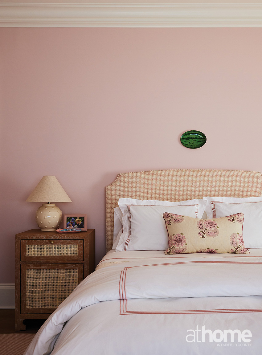
She wanted it to feel happy and joyful, and she also loved blue. In a lot of ways, it was about giving her that blue but also making it feel a bit more interesting than just one blue room after another. And then playing with the tones of blue, a bit off from the ones that you’re used to seeing. There’s no straight navy, right?
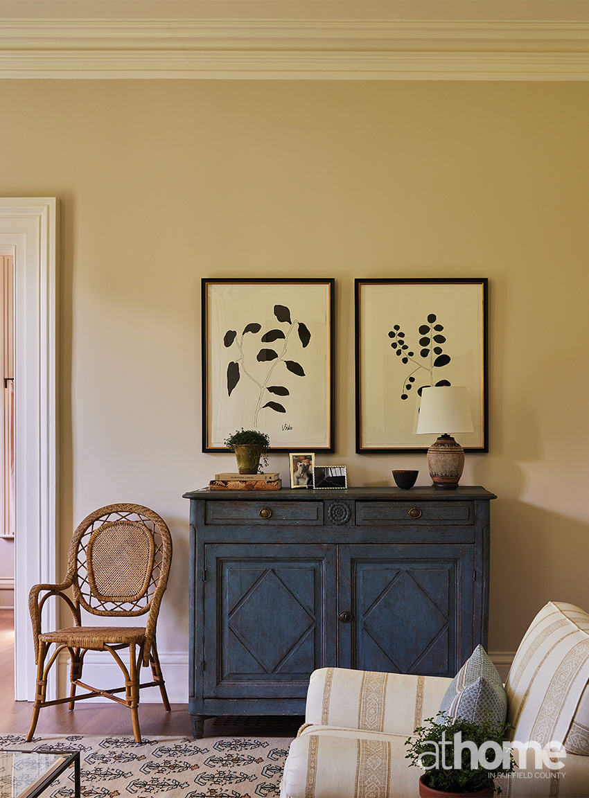
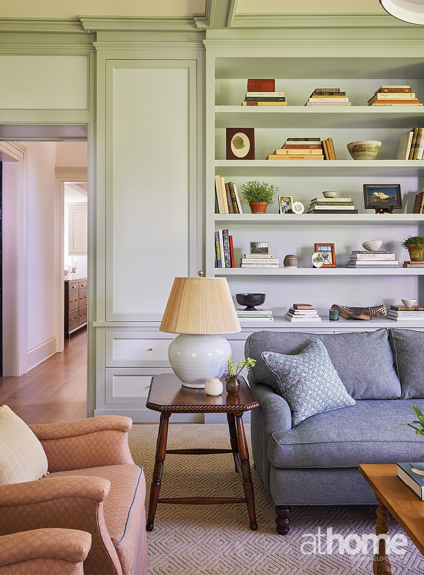
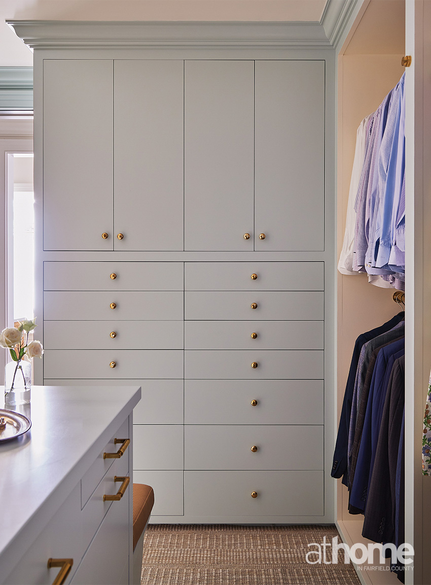
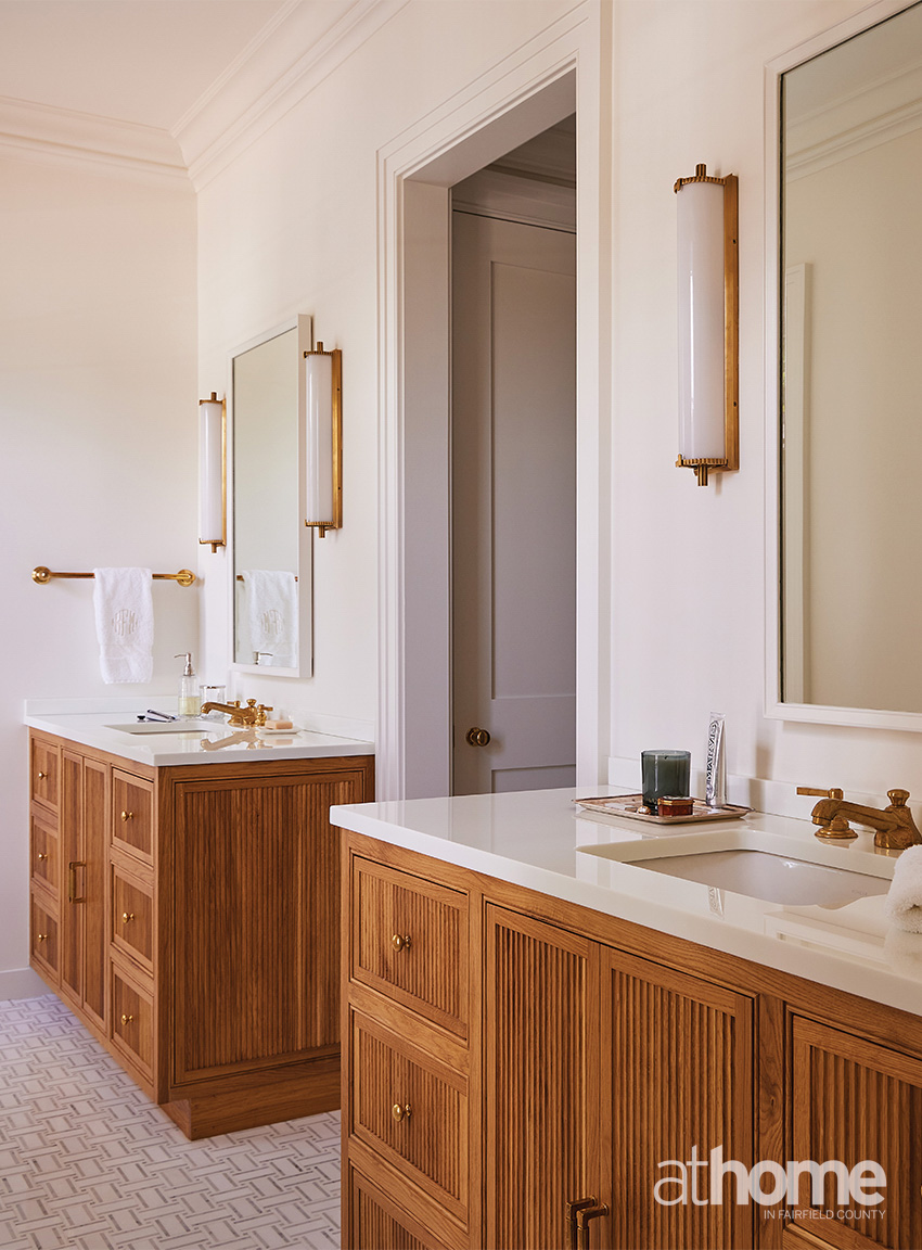
We also wanted the scale of the furniture to really feel like it fit the home. We made sure that we could use some of the antiques that she already had, and work in some of those brown wood tones that come from those pieces, but also make sure that floor plans functioned in a way that supported their everyday life.
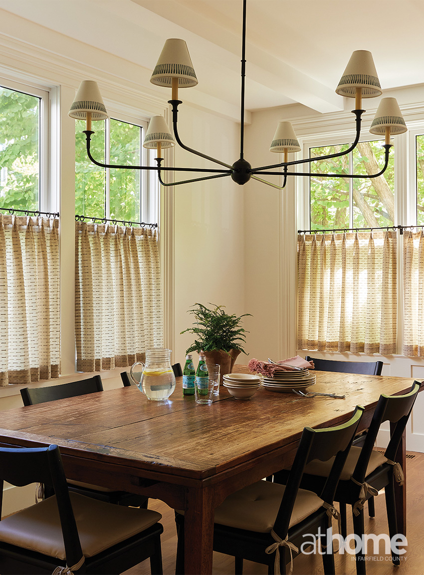
You have such a fun mix of wallcoverings and patterns in here. What’s your strategy for print mixing?
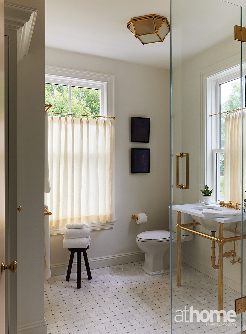
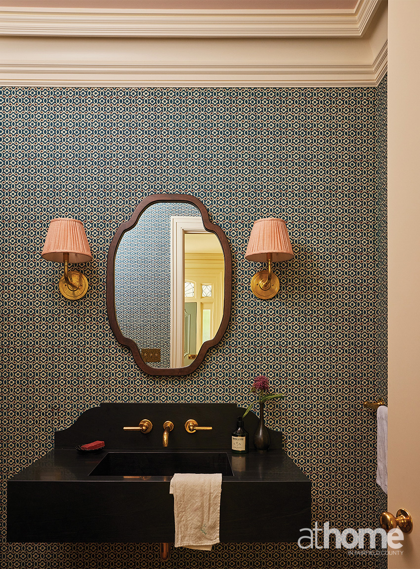
I love a small print. It’s my total wheelhouse. So, I’ve always navigated myself to smaller prints, but we knew the architecture was so beautiful. The windows were gorgeous, and we didn’t want to cover them up with a lot of print in the major common rooms.
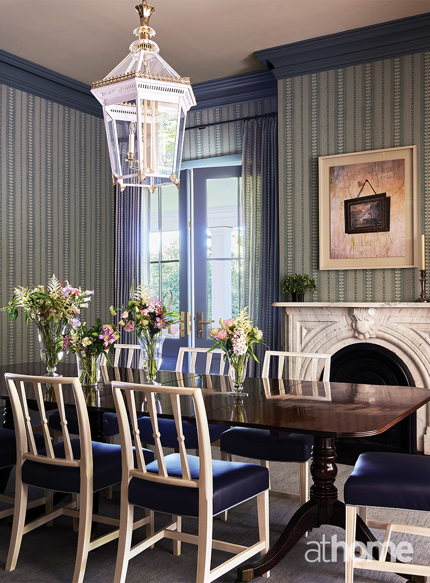
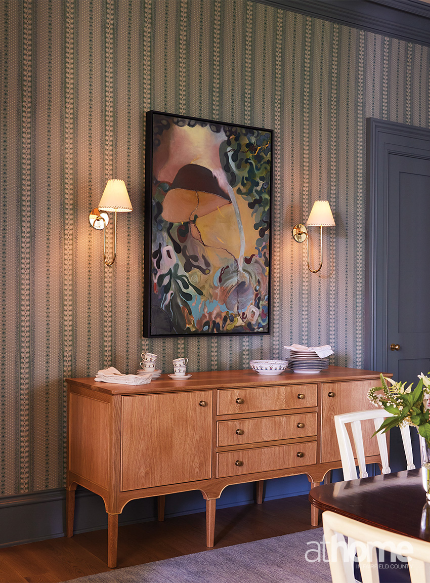
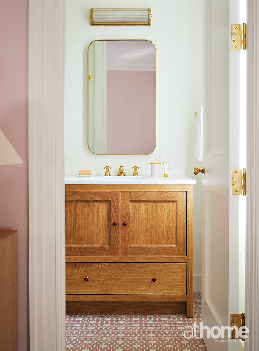
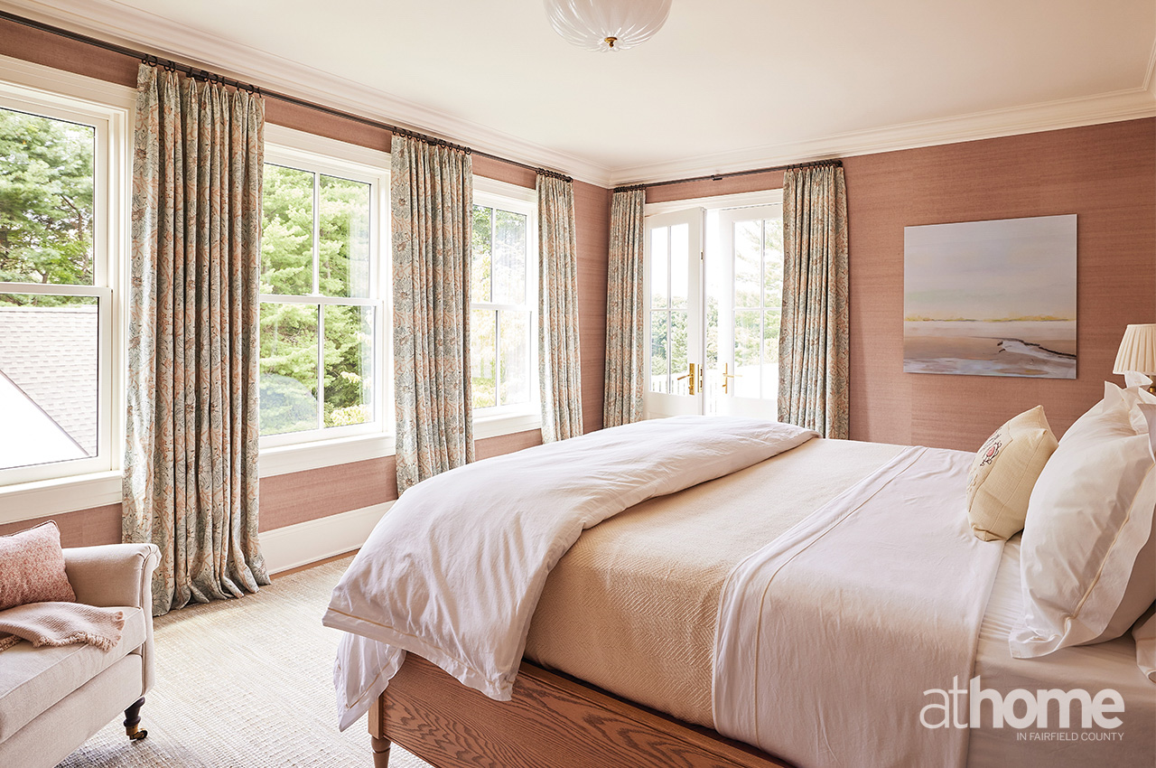
We went with wallpaper strategically in the powder room and went with more of a grasscloth in her primary bedroom. In the dining room, we liked the idea of a stripe because it felt very Greenwich and traditional, but we wanted to have a little bit more fun and loosen it up a bit because I would also say this family’s not serious. I wanted the house to reflect a levity that the whole family really has.
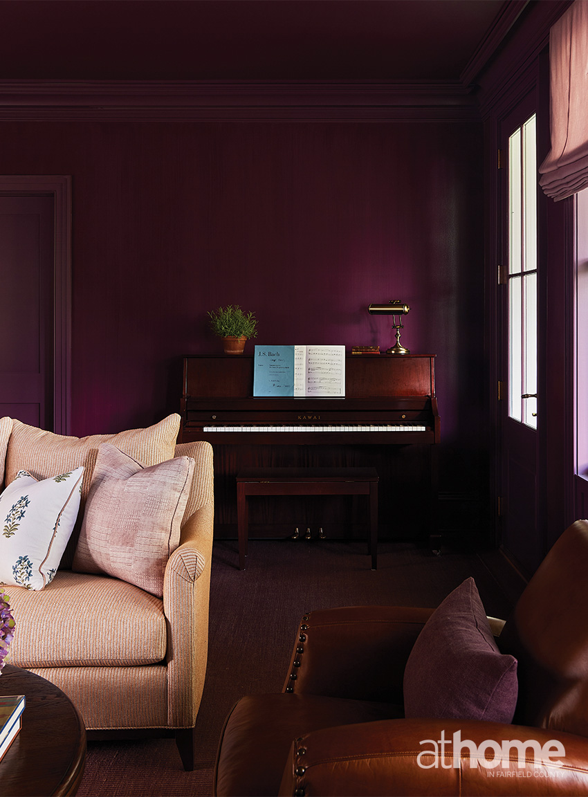
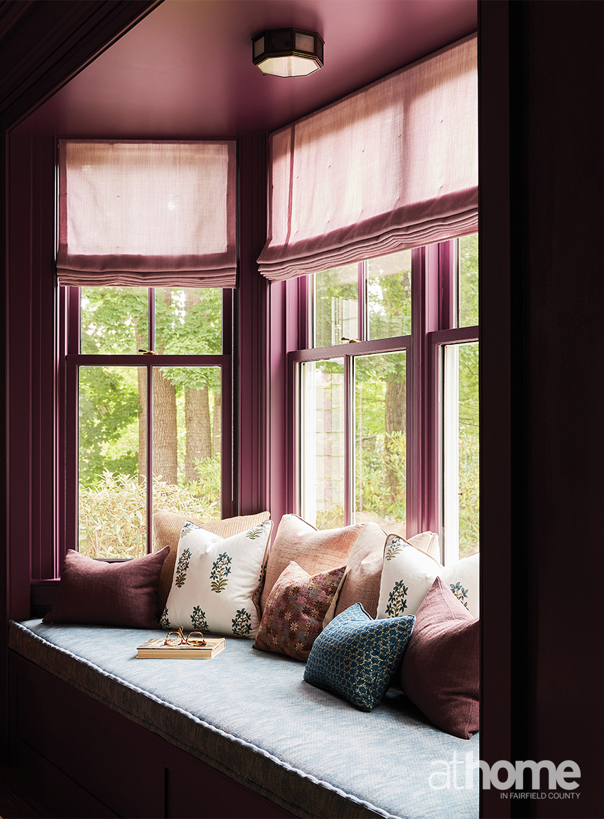
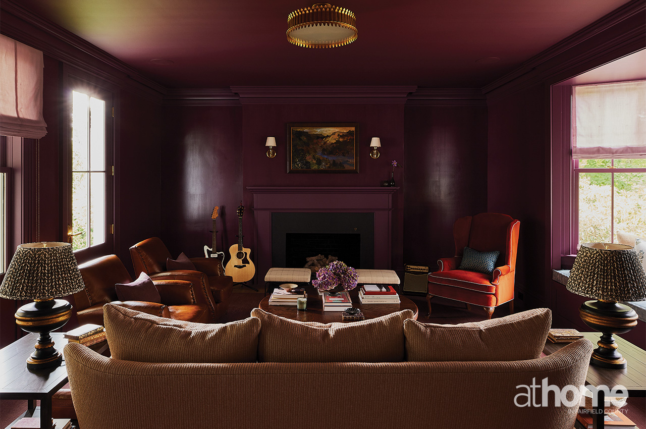
Tell us about this purple room.
We always called it the music room because her daughters play guitar, they play drums, they have the piano.
It’s the darkest room in the house and it’s also not connected to any other room. So, it’s truly its own destination, in and of itself. Because it feels like the darkest room in the house, we wanted to embrace that. We felt like all the other rooms have a white or an ivory or beige base to them, but we wanted to kind of go darker and richer in there. I think if you had that many rooms to work with, it’s nice to have what I call like a winter room. It’s an aubergine color and she was just all in on the purple.
Do you have a favorite room or moment from this house?
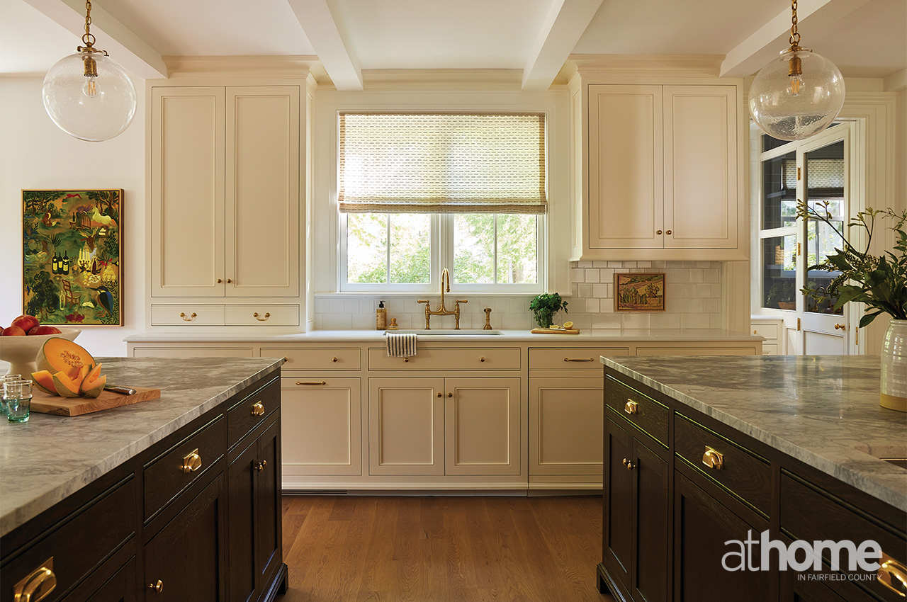
I love the kitchen, which is so nice and large. They love to cook and like so many families, they hang out in the kitchen.
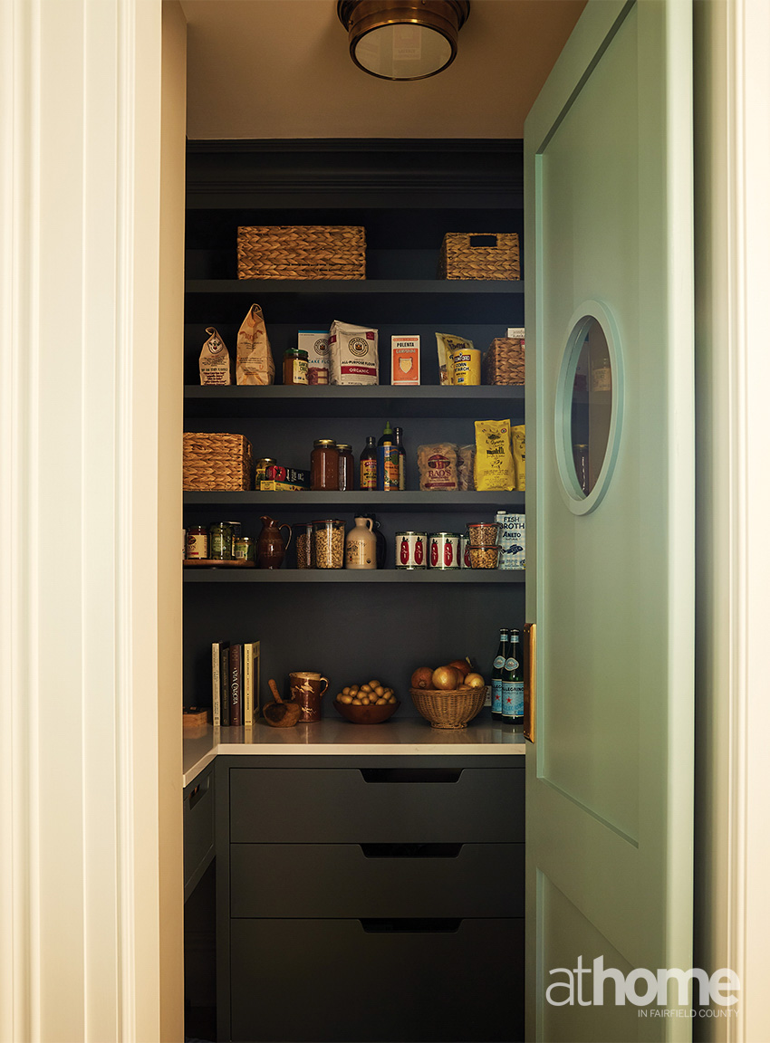
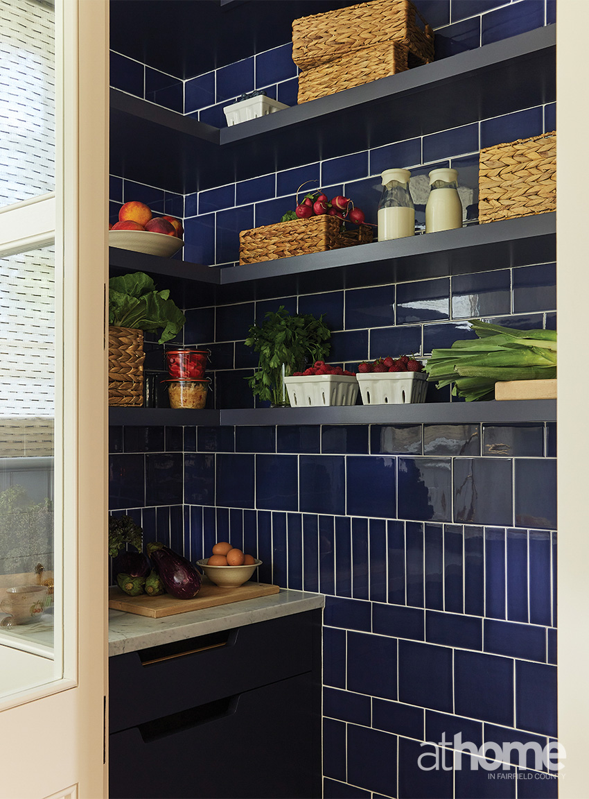
She also wanted a scullery and a larder and would laugh at how funny and ridiculous those two rooms sounded. But they give her joy and laughter.
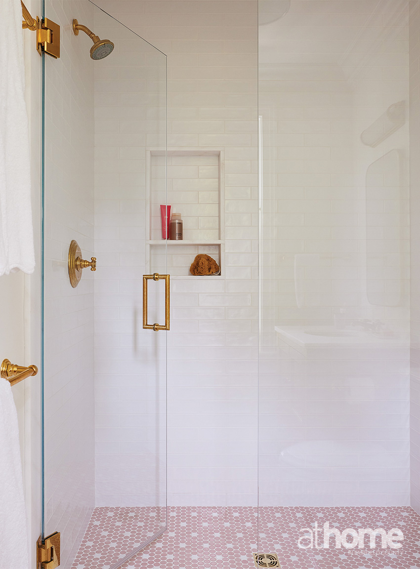
The scullery is just off the kitchen and it’s just flows from the kitchen. It has the same cabinetry, but it has windows on both sides. The larder is another place where we used a lot of color with the tile. It’s like a blue-violet color that you really don’t see unless you turn the corner into the space. The different tile sizes create a pattern that gives a nice backdrop.
And then another favorite space is the living room. I just feel like I want to entertain in that room and I’m not a big entertainer at all. Or I could just sit on the sofa and read.
But the feel of the space, it has that intangible vibe you get from a house, especially from an old house.
What was the biggest challenge for you?
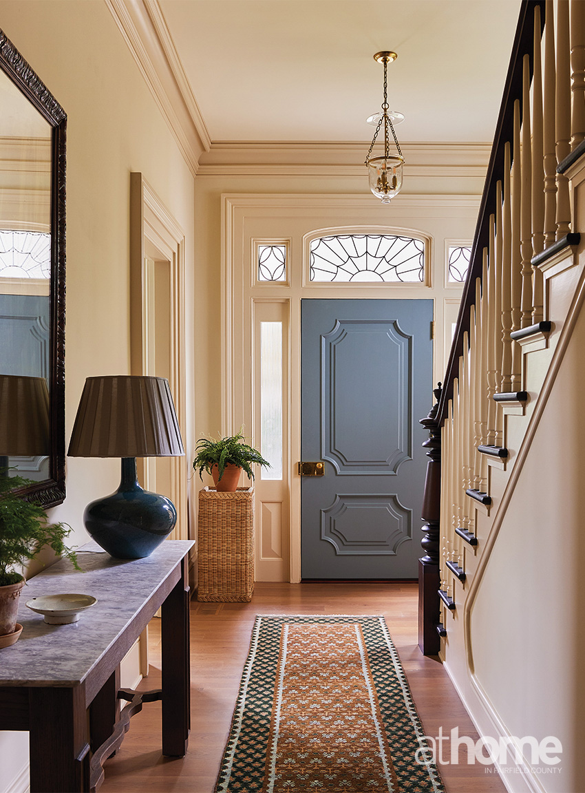
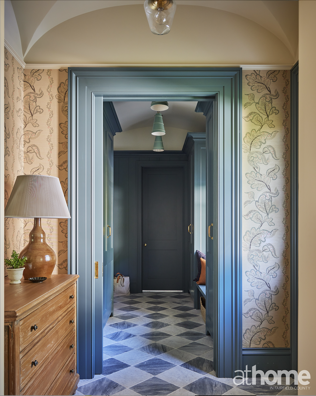
As we went along with the construction, we realized that we had room in the mudroom to do more of a dome ceiling. I struggled with that ceiling quite a bit, but I think we landed in a nice place. And we wanted to focus on the mudroom entry because frankly, this is where the family is coming in and coming out. We wanted to give it just as much attention as we did the main entry and make it feel special.
Why is color so important to you?
I don’t envision rooms without at least a little amount of color in them. I’m not a real formal person, and for the most part, I want the design to feel accessible and joyful. It just adds to the whole dimension of the room.
RESOURCES:
Interior Design: Nina Carbone Inc, New York; ninacarbone.com
Architect: Howard Kelly, HK2 Architects; hk2arch.com
General Contractor/Builder: Robert Lewandowski, RL Construction; 203 667-1794
Owners’ Rep: Hillary Corbin, HL Corbin, 202-262-1902; hc@hlcorbinllc.com