Hue’s The Boss
In this Greenwich home, Studio DB takes traditional entertaining spaces to colorful new heights
INTERVIEW WITH BRITT AND DAMIAN ZUNINO, STUDIO DB // PHOTOGRAPHER IAN BAGUSKAS

Tell us about the clients. What were their asks for these living and dining spaces?
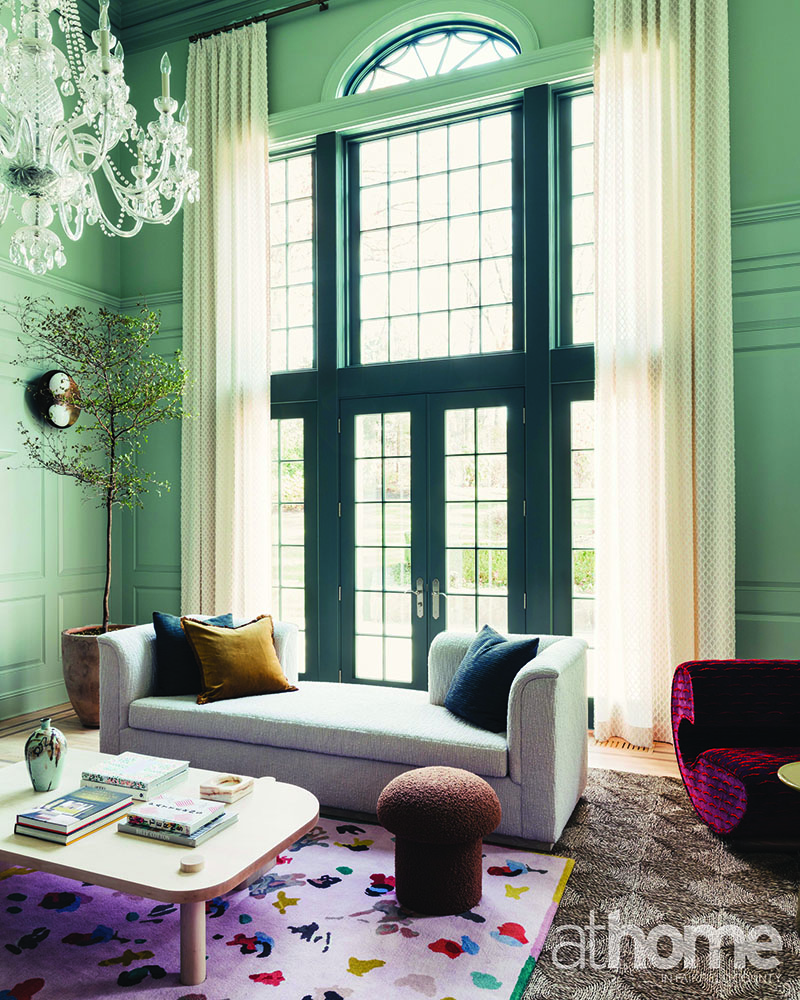
Studio DB: Our clients had recently purchased the traditional property and were looking to infuse some colorful personality into the home. Our primary focus was to freshen the foundation of the main entry and grand double-height living room. We started by lightening the floors and creating a strong visual color direction.
Our clients are musicians and love entertaining. They often host large gatherings and play music, so they craved a flexible space that could accommodate large groups as well as intimate family gatherings. The furniture plan was created with this in mind, with various vignettes for dining and places to perch.

What was the jumping-off point for the palette?The wife is very fashion-forward and was looking for a statement room; white walls were never a consideration. We looked to fashion for interesting color combinations, specifically the runway collections of Valentino and Stine Goya.
Assuming the paint came first, how did that affect the furniture and décor selections?We looked at the room holistically and pulled many fabrics and finishes together in the scheme first, using our original fashion and art inspiration as a guide. We finalized the wall color closer to the end. The living room rug was more of a driving factor in the room’s color palette.
What’s the hardest part about working with such bold colors?
The toughest part of working with strong colors is getting the balance correct. For every bold move, the colors need to be tempered by something neutral. Our goal is to expand the definition of what is neutral, considering sophisticated colors like olive green, oxblood and pale blue-green instead of beige.
Professionals:
Interior Design: Studio DB, New York,
212-608-6379; studiodb.com

